Get focused on getting customers
Expert help for a furniture seller whose Web site needs to make a better first impression.
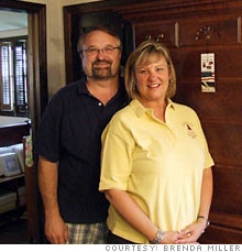 |
| Brenda Miller, owner of The Miller House |
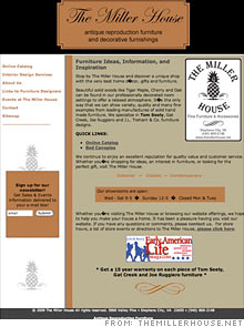 |
| The home page needs images of the furniture to reinforce the message of the company. |
 |
| The catalogue pages should have images for each item being sold and a hyperlinked option to see more details. |
NEW YORK (CNNMoney.com) -- QUESTION: I would like some input on my updated Web site, http://www.themillerhouse.net/. I am one of the top dealers in solid wood furniture manufactured by Tom Seely Furniture. I have owned my part of our family business for six years, and I really want to be competitive in the market even though we are a small business.
- Brenda Miller, owner, Stephens City, Va.
The main problem with your Web site is that you're not giving visitors what they'd expect. Your tag line is "antique reproduction furniture and decorative furnishings," but a glance at your home page shows nothing that reinforces that message.
"Like anything on the Internet, it takes less than three seconds to get a first impression. I didn't think you sold furniture," says Marissa Frydman, account manager at Deepend, a marketing and design firm in New York City. "Nothing draws you in; people will look at the site and see the logo and links, but they won't read the text."
Your home page right now is more along the lines of what visitors would expect from an "about us" page. The first page of the site should show them very quickly what you offer. Only after you get their attention will they be interested in reading about the details.
Once you have a visitor, you want to keep them. Right now, the most prominent clickable thing on your home page is the graphic for Early American Life magazine. This seems random, and clicking it immediately takes the reader away from your page.
If visitors do stay on your page to explore, they'll likely click on the online catalogue link expecting to find photos and information on the furniture you sell. Instead, they'll wind up at a site hawking home accessories.
"If viewers want to see the antiques, your site is telling them, 'this won't be easy,'" says Rich Schefren, CEO of Strategic Profits, a marketing consultancy firm in Delray Beach, Fla. "It's like people calling me for Web site help and then I ask about their car problems."
The experts that checked your site noticed that you are trying to emphasize your Tom Seely furniture. Is this your unique selling point? If so, make sure your visitors know why. Some people looking for furniture may be searching directly for his product, but chances are that most of those who land on your site have no idea who he is.
What makes Tom Seely furniture distinctive? Looking for the answer to that question, viewers may click on your "links to furniture designers" page, but that page simply links to outside sources. Plus, the "Custom Web Design" link is random and unrelated. Disconnects like that can reduce your site's credibility with visitors.
Here's a tidbit about Tom Seely to consider: Schefren did some keyword research and found that there are 1,000 searches a month for Tom Seely and 200 searches a month for Tom Seeley - an incorrect spelling of the designer's name. By including both spellings in your meta tags, you can capture more traffic.
Take a look at the pages you have linked on main site's left-side navigation bar. They should be organized from most to least important. "Home" should be at the top, and "Sitemap" shouldn't be there at all. (On small Web sites like yours, site maps are used mostly by search engines to understand what your site is about, not by visitors.) Frydman suggests sticking the site map link at the bottom of your page, near the privacy statement.
Your site features a page advertising your interior design consulting. That seems like it could be one of the most important services your company has to offer, but the page itself is a letdown.
"I imagine a personal letter from Brenda that says what customers can expect from her, followed by before and after photos, categorized by different styles she's done," says Schefren. "I see a photo of a kitchen here, but I want her to show me what it was like before she had a crack at it. At the bottom of the page, there's the cycle-through photo gallery, but I don't know if she made it look better or worse."
The flashing graphics used in that gallery can be hard for viewers to follow. Instead, you should feature a gallery with high-quality before and after photos, and allow visitors to click through the images at their own pace.
At the very bottom of this page, the text says the first hour of consultation with you is free. "That's a big deal!" Schefren exclaims. "That should be on the top and even on the front page, but you've buried it."
Once you've got some of these organizational obstacles corrected, you should make it a priority on each page to include information about your company that will make the viewer want to talk to you rather than any other antique reproduction furniture company out there. Your site does not have an e-commerce platform, so you'll have to work extra hard to get visitors to pick up the phone and call.
"You have to sell them on the company before you sell them on any product," Schefren says. "Put in information that is useful. I don't care when you started the company, but I might care that you grew up in the furniture business. Now prove to me that you are the best vendor."
You won't be able to compete on price with a large wholesaler or eBay, so you have to make the viewer feel that they are actually in your store, getting a personalized experience. Will every piece be personally inspected ten times before it is shipped? Does every customer receive the benefit of your dedication to finding the item that's exactly right for them? Can you list key differences between each antique reproduction furniture manufacturer you feature? If yes, then say so on your site, in ways that articulately convey your passion and expertise.
Your newsletter is a great way to build that personal connection - but first, you need visitors to actually sign up for it. Entice them by hinting about what your next newsletter will feature.
"Make it store propaganda," says Schefren. "It should say 'Sign up here to find out the top seven mistakes made when buying antique reproduction furniture' or something that, which will both intrigue the buyer and convince them that this is the place to shop."
The first step in building credibility with potential buyers is having a site that immediately appears clean, tidy and professional. You can make some aesthetic improvements to boost that image.
Take advantage of the space available for your site by eliminating the white areas on the right and left of the screen. Your Web site is set up at an 800 by 600 pixel resolution, but the default for displays today is actually 1024 by 768. Changing the resolution will bring more content to the white area and will eliminate the scroll bar on some of the pages on your website.
Consistency is the key in making users feel comfortable on a Web site. Right now, you have multiple logos, with different text fonts and sizes -- and when visitors get to your catalogue, they are presented with a white background instead of the brown used on the home page. As you make the color scheme consistent, you might want to reconsider the dark hues.
"Brown is the color of furniture, but there are other good ways to get that antique feel across," says Frydman. "White is fresh and will provide a good contrast between the text and the background. Right now, the black-on-brown scheme is difficult to read, particularly for older people or the color blind."
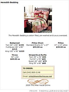
Your catalogue is nicely categorized, but it also needs to be uniform. The images should all be the same size, and each should have the same amount of text. The large images of the bedroom sets, for example, are good to show how all the products can look together, but it's difficult for the viewer to know which is the sham and which is the pillow and which is the throw. Frydman recommends one smaller image for every product with a bit of descriptive text for each photo. Then, give the customer the option to open a separate window for more details and an enlarged photo of each item.
"There's no harm in making more pages, and it's better for the search engines [to identify the content] if each page is for a separate product," Frydman says.
But there is one place where consistency is bad: Your meta tags. To help viewers and search engines, change your tags so they are full of words that precisely describe each specific page. For instance, your title tags, which present the text at the very top of your browser, all say "The Miller House Antique Reproduction Furniture." But if viewers have many tabs open, it'll be difficult to move between them unless they know which tab is for "sleepwear," which is for "bath soaps," and so on.
Because your site doesn't seem to be set up for online purchases, you need to make sure the call number is placed prominently - but Frydman doesn't think it's necessary to list it after each product. "At the top of the page is fine," she says.
Frydman also noticed some "buy" buttons in the catalogue that lead to error pages. "That's scary for the customer," she says.
As you take in all these tips, keep in mind that the ultimate goal is to keep things simple for the customers so that they can find what they are looking for with as few obstacles as possible. For inspiration, take a look at the Web designs of some large furniture stores like Crate and Barrel and Pier1.
In our "Website remedies" feature, CNNMoney.com enlists Web marketing and search-engine optimization specialists to analyze small-business Web sites in need of an overhaul. Could your site use a makeover? E-mail us at smallbiz@cnnmoney.com. Plus, share your tips for improving our featured sites in our discussion forum. ![]()
-
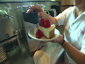 The Cheesecake Factory created smaller portions to survive the downturn. Play
 -
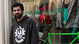 A breeder of award-winning marijuana seeds is following the money and heading to the U.S. More
 -
 Most small businesses die within five years, but Amish businesses have a survival rate north of 90%. More
 -
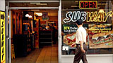 The 10 most popular franchise brands over the past decade -- and their failure rates. More
 -
 These firms are the last left in America making iconic products now in their twilight. More