What's in a new logo?

It can invigorate a company's image or squander its brand equity. To see which gambles paid off, Fortune turned to a few experts to judge some of the most dramatic transformations.

1 of 12
BACKNEXT
Apple - A chic redesign
Talk about a makeover. Just imagine what an iBook or iPhone would look like with this image on it: definitely not as chic.

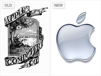
Ronald Wayne designed Apple's original logo in 1976 when the company was still operating out of a garage. It shows Isaac Newton sitting beneath a tree with an apple dangling precariously above his head.

Rob Janoff used the same apple in his redesign a year later. "You can almost feel the '70s and '80s taking place when you take a look at that rainbow apple," says Bill Gardner, principal of Gardner Design.

Apple dropped the multi-colored logo in 1998 for a monochromatic version, produced in every color imaginable, until transitioning it to today's popular shade of chrome.


NEXT: Blackwater to Xe -Sneaky and confusing
Last updated August 10 2009: 11:36 AM ET
Email | Print | Share  |  RSS
 
google my aol my msn my yahoo! netvibes
Paste this link into your favorite RSS desktop reader
See all CNNMoney.com RSS FEEDS (close)
More Galleries
5 sages read the future of print What becomes of the printed word? What's the fate of companies that produce periodicals and books? Here's what 8 media and tech luminaries think. More
Meet the market's biggest losers Fortunes have been made and lost since AOL was last a standalone company. Here are the 10 companies that have lost the most in market value over the past decade. More
No layoffs - ever! These employers are remaining loyal to their workers, even in a downturn. Meet 6 of this year's Best Companies that, as of mid-January, have never had a layoff. More
* : Time reflects local markets trading time.† - Intraday data delayed 15 minutes for Nasdaq, and 20 minutes for other exchanges.• Disclaimer