Windows 10 looks more like "Windows" than its Windows 8 predecessor. But it isn't a full regression to Windows 7.
The new version of Windows has a modern, updated look. Windows have perfect right angles instead of rounded edges, and hardly noticeable are the drop shadows that give you perspective about which windows are on top.
The tops of Windows have a Mac-like gray color to them. The taskbar, Start Menu and action center automatically choose a color from your background photo (you can override that), and settings have large, finger-friendly buttons and a flat, white background. The status icons for Wi-Fi, battery and sound all have a new, cleaner look.
Taskbar icons glow at the bottom when they are opened, but only the app icon that is currently being used is completely highlighted. In previous versions of Windows, all open apps were highlighted, confusingly.
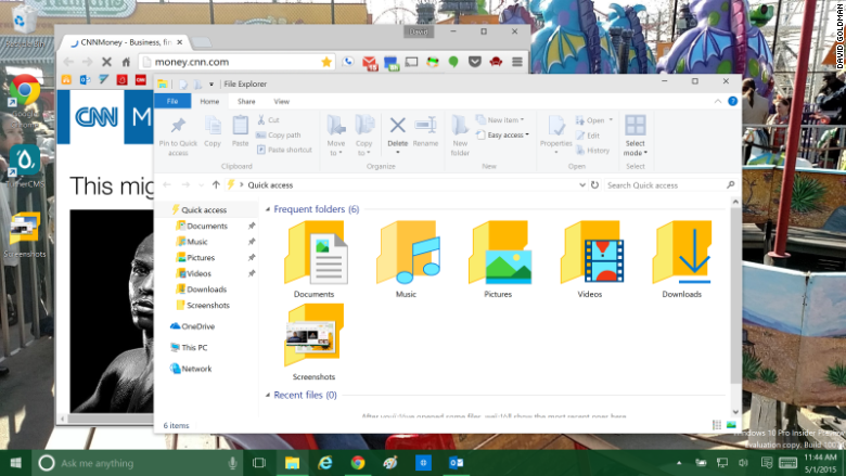
Folder icons are far less glitzy and much more intuitive in Windows 10, making it much easier to view the contents of the folder at a glance before you open it. Gone is the confusing and redundant "libraries" directory.
There are a few oddities that Microsoft might clean up before the final release, including two different microphone icons in Cortana and the power button strangely appearing above "all apps" in the Start Menu.