Netflix is taking an unconventional approach to its branding.
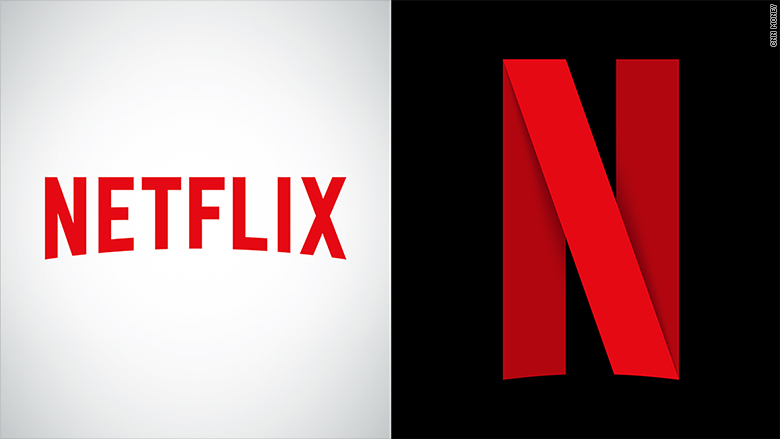
The company dropped a new logo -- and it dropped the "etflix" in favor of a simple red "N." It appeared on Netflix's Instagram, Facebook and Twitter profiles Monday, and the ensign will also soon be the face of Netflix's (NFLX) mobile app.
What's unusual is that the company also plans to continue using its old logo as well -- "Netflix" spelled out in red letters on a white background.
Traditional marketing adage says multiple logos is risky because it can create "brand confusion," says Sterling Marketing founder Karen Leland, like when Coca-Cola (CCE) launched New Coke in 1985. It was a massive failure.
Netflix's decision, could be driven by "the way the logo will appear on social apps," Leland added. "A lot of people are accessing those on their mobile devices," and the slimmed down design could be an attempt to save space on a smaller screen.
Related: Netflix reveals which shows we binge watch the most
Social media buzzed with users surprised by the change and wondering if there was more to come. Netflix responded to some Twitter users, insisting the previous logo isn't going anywhere and the "N" logo is akin to a "new piece of statement jewelry" intended to add "a little flair" or "pizazz."
Netflix is not the only young tech company to diverge from that line of thinking. When Uber rebranded in February, it unveiled one primary logo -- that spells out Uber -- and an "atom and bit" logo for its mobile app icon.

