Reviewer Rob Pegoraro is putting the new iPhone 5 through its paces and keeping a running journal of his impressions. Have any questions about the phone? Leave us a comment about what you'd like to see Rob tackle in future updates.
Apple's new iPhone 5 may not feel that much thinner than other phones, but it's dramatically lighter--in a way that makes you wonder if somebody forgot to put the battery inside.
But it's there, and so are all of the other parts of a modern smartphone. I bought a 16-gigabyte model from a Verizon Wireless store Friday morning to see how those components work together in this device ($199 and up from AT&T (T), Sprint (S) and Verizon Wireless (VZ), with prepaid carrier Cricket Wireless adding it Sept. 28).
I'll be writing about it in a series of posts here over the next several days. For today, I'm going to stick to things close to the iPhone 5's surface: its look, its feel and the Maps app that you may have already heard about.
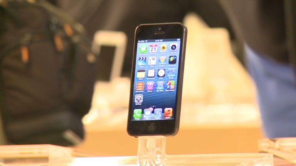
Two of those things are better than the other. The iPhone 5 ups the precision-machined sharpness of the iPhone 4 and 4S with a delicately beveled edge that catches the light as you turn the thing over in your hand. (Too bad it may have already picked up one scratch from the coins in my pocket. Others have seen the same issue.)
The phone's shrunken dimensions required two trade-offs: a new Lightning connector that won't work with older dock-connectors without a $29 adapter that isn't in the box, and a nano-SIM card slot that won't accept existing cards without some tricky surgery. The cable disconnect won't be a big deal for many users, but fragmenting the SIM standard seems a high price to make this thing a few millimeters thinner.

I'm not bothered by the added length of the iPhone 5, required to accommodate a 4-inch screen no wider than the old model, but the extra pixels don't do much for me either outside of list-centric apps like Mail. The ever-larger screens of Android phones may have skewed my judgment here.
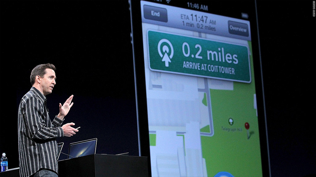
Finally, there's Maps. I don't mean to pile on, but this replacement for Google Maps is embarrassingly inept. It doesn't list the new Yards Park and 11th Street Bridge in Washington, D.C.. It put the Kennedy Center and Dulles Airport at incorrect addresses; its directions to the latter could get a driver arrested and possibly run over by a 747. And it suggested a route into the District on a bridge that a construction project has temporarily removed. (The Google (GOOG) Maps app on an Android phone made none of those mistakes.) This isn't just amusing, it's dangerous.
To add to Maps' malfunctions, revising directions takes too many taps and getting transit routing requires installing extra apps -- possibly even separate ones for each city and even each transit system. I hope it's true that Google will ship its own maps app and that Apple (AAPL) will approve it -- or that this current sorry attempt is the cartographical equivalent of Mac OS X 10.1, an early release we tolerated and soon forgot as Apple quickly shipped improved replacements.
What else would you like to know about the iPhone 5?

