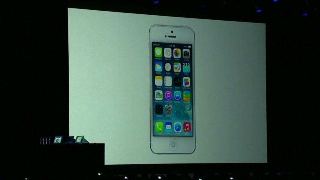
Even if it offers nothing truly groundbreaking, iOS 7 is an important step forward for Apple and the future of the iPhone in general.
The new update to the iPhone and iPad operating system is much more than just a fresh veneer. Beyond its flattened user interface that no longer tries to mimic real-life textures, you'll find that iOS has been rethought as much as its been redesigned.
Every core app that Apple (AAPL) includes with iOS has been given a facelift. In many cases, those apps have been newly conceived. For example, the Photos app now models itself after Facebook's (FB) Instagram, and the music app baked in some crucial, Pandora-esque (P) streaming functionality.
It's true that many of the revamped, improved and new features found in iOS 7 are examples of Apple playing catch up with Google's (GOOG) Android and Microsoft's (MSFT) Windows Phone.
New features like Control Center, which lets you quickly tweak settings, appears ripped straight from Google. A new card metaphor for app switching first appeared on the ill-fated Palm Pre in 2009. In iOS 7, every app will have the ability to run in the background and update itself without user interaction, just like Android. And the daily agenda view in Notification Center very much feels like a response to Google Now.
Related story: Apple overhauls the iPhone
Still, these much-needed, overdue changes address some substantial problems that had been plaguing iOS for years. Just because Apple didn't think up these ideas doesn't mean that iOS isn't better for employing them, and adopting the better parts of its competition only helps to accentuate Apple's undeniable strengths, such as its app ecosystem.
And even if they're less pronounced, Apple still showed off some new innovations in iOS 7.
Apple didn't just go "flat" with its new user interface -- it went one step further than what Android and Windows Phone have been doing. Apple skillfully used layers and translucency to re-introduce a sense of depth to iOS. Some people in the tech community, including Gizmodo's Kelsey Campbell-Dollaghan, have argued "depth" is the next step after the flat UI craze.
Related story: 6 best new Apple products from WWDC 2013
A feature like the parallax wallpaper, which orients itself differently depending on how you hold the phone, adds enough of a "gee whiz" factor without getting in the way. It may seem totally superfluous, but those kind of design innovations give some humanity to iOS.
With iOS 7, Apple has positioned itself a half-step ahead of the pack in the design arena. That's a major achievement given how archaic iOS was starting to look.
Consider the fact that, under the leadership of design chief Jony Ive, Apple overhauled the entirety of iOS in less than a year. That process began immediately after CEO Tim Cook kicked Scott Forstall, iOS' former leather-loving boss, to the curb and restructured Apple's leadership.
If iOS 7's performance meets the expectations that its new design has set, it serves as a promising sign that Apple's executive team is capable of keeping the company humming along. Apple may not be light-years ahead of the competition like it once was, but at the very least, iOS again resembles a modern mobile operating system.
Now, Apple can once again focus more on innovating and less about preventing itself from from falling on its face.

