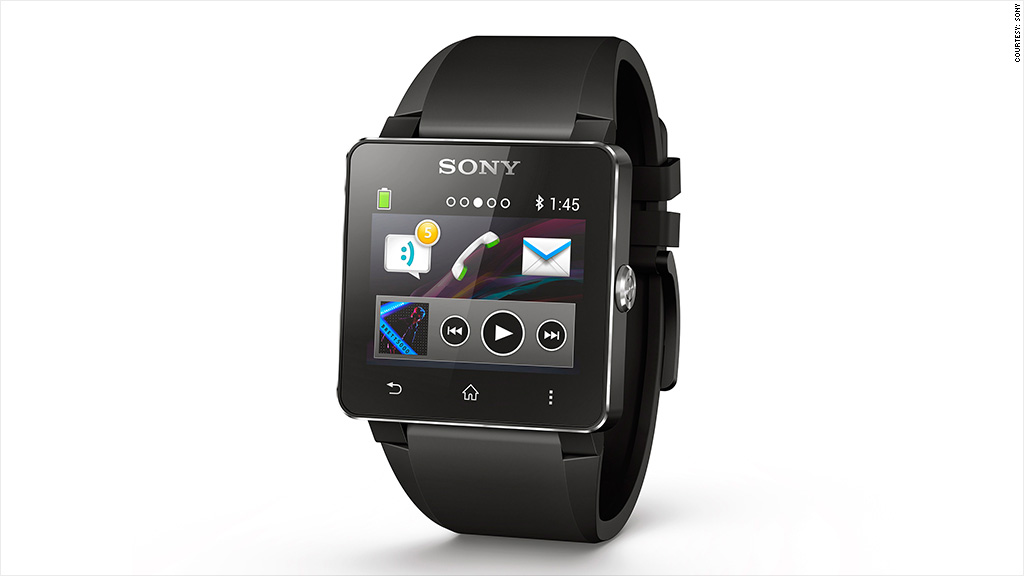
Last week, Sony announced the Smartwatch 2, a follow-up to last year's rightfully maligned Smartwatch. As unimaginative in concept and execution as it was in name, the watch was the abject failure it deserved to be. Using the thing was awful.
This year's iteration boasts a waterproof housing, a few extra pixels in a slightly larger display, and NFC (near-field communication) functionality, but the basic concept is unchanged from the last generation. Sony (SNE) expects us to interact with its smartwatches as though they were dumbed-down smartphones.
It's an idea that will immediately resonate with the masses. It triggers those childhood sci-fi fantasies. But it's also certain to frustrate and confuse, because it's not how wearable tech should be implemented.
We've seen demos of flexible touchpanels and contextually aware components, but we're still hung up on trying to mount tiny, self-contained displays on a technologically inert band.
Just as early tablets were hell-bent on trying to wholly replicate the function of a desktop PC, most current smartwatches are caught up trying to mimic the UX and UI of a smartphone. That's an ugly solution.
Consider Apple (AAPL)'s patent application for a smartwatch-type device, or the recent product concept sketched out by Frog Design: their hypothetical products bear little resemblance to a conventional watch. These are just rough, early ideas, but they at least offer insight into how some of the world's best tech companies and designers are thinking about this space.
The concepts have information displayed across the wrist in non-traditional but potentially more efficient manners. They recognize that there's a better way to convey data than working within the confines of a small rectangle.
Corporate partnerships notwithstanding, there's a good reason why Apple CEO Tim Cook publicly professed his love for his Nike+ FuelBand fitness tracker: It's not trying to be a watch. It's not pretending to be a watch. It wants to be new.

The FuelBand hasn't realized its full potential by a long shot. It's extremely limited. But you can better envision the future possibilities of a device that looks and behaves like a FuelBand than you can with these devices that mimic watches.
If our smartwatches can help us determine whether or not we need to pull out our phones to field a call or email, that's exciting. If they can predict our next activity and give us all the contextual information we need -- navigation, weather and so on -- that's exciting. If they can collect ambient data on us and our surroundings (our vitals, location, any nearby friends) and relay that back to our phones, to our Internet of things, to the rest of the world -- that's exciting.
But if we can do all of this without wanting to chuck the gizmo out a window, that's what will make them great.
I recently struck up a conversation with an industrial designer who lamented the expectation that smartwatches have to look and function like smartphones on our wrists. In reality, they just need to effortlessly deliver important information at the moments we actually need it.
We don't need to directly interact with Twitter and Facebook (FB) from our wrists. We don't need to watch YouTube videos, either. And if we're going to take up that space on our wrist, the whole band might as well be put to good use.
That basic sentiment is something that Google (GOOG) has correctly latched onto with Glass. Instead of giving users unfettered access to the entire Web, Google crafted a very specific experience that only offers access to the most essential information. The point isn't to replace your smartphone or computer. It's to avoid having to use them when you don't absolutely need to.
Just like the phone functionality isn't the primary feature of smartphones these days, timekeeping will hardly be the main reason to wear a smartwatch, or whatever we end up calling them. By trying to fit all these exciting new ideas into an antiquated analog, we're ultimately limiting the imaginative possibilities of these devices.

