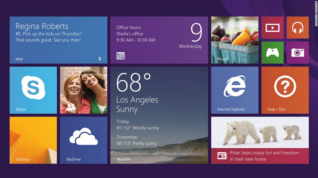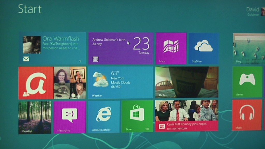
Microsoft on Thursday released Windows 8.1, a vastly improved update of its forward-thinking but flawed PC operating system.
On paper, the list of changes that Microsoft made to Windows 8.1 don't seem all that major. No, the app tiles aren't gone. Yes, the Start button is back, but not exactly as you remember it.
But it isn't until you actually start using the latest version of Windows that you can appreciate the big benefits of little tweaks.
Start button: The return of the Start button to its rightful spot on the desktop taskbar is a perfect example.
The Start button's main function in Windows 8.1 is actually to call up the Start screen (the series of app tiles that Microsoft (MSFT) calls "Modern UI," which was introduced in Windows 8) -- not the labyrinth of nested menus that it used to hide. But when you're in desktop mode and you click the Start button, it won't take you completely out of the desktop. Instead, a semi-transparent version of the Modern UI will float on top of the desktop, allowing you to choose an app.
That feature also allows you to control how you organize the Start screen. You can quickly lump together all the icons for your desktop apps in the Modern UI and label them as such.

In other words, the new Start button brings back all the functionality of the Start button from Windows 7, but with the look and feel of the more modern Windows 8.1.
Related story: 3 ways to improve Apple's Mac OS X
Snap view: The biggest change in Windows 8.1 is the expansion of the "snap view" feature that enables multiple apps on the screen at the same time.
Windows 8.1 will let you run up to eight apps side by side -- up from just two in Windows 8. (That's provided you have two 2560x1600 resolution monitors. On a smaller device like the Surface, you can still only have two.)
Unlike Windows 8, which ran the second app in snap view as a more limited widget in a small strip of the screen, Windows 8.1 lets users decide how much space each app takes up on the screen -- half? a third? a quarter? Your call!
To make Windows 8.1 users feel less locked into a single app, snap view will automatically launch in certain situations. For example, if you're reading an email and you click on a link, you will no longer exit the email app and go into the browser. Instead, the screen will automatically split itself into two (if it isn't already), and Internet Explorer will pop up right next to your email app. You can even rearrange panes and drag and drop files between them as easily as you would two windows in desktop mode.
Related story: Windows 8 fixes are on the way
App improvements: Microsoft has put in a lot of work into more tightly integrating its own services throughout Windows 8.1.
For example, if you search for a musician using the Bing search app, links and play buttons to that artist's songs and albums will be integrated into the results.
When you receive a Skype call and your computer is locked, you will be able to answer the call without having to first unlock your computer.
And most importantly, the SkyDrive cloud storage service will be more tightly woven into Windows 8.1. SkyDrive won't just make your cloud files look and feel native inside Windows, but it will also sync all your Windows and app settings on the fly, so that you don't have to reconfigure every Windows 8.1 device you use.
Related story: Analyst wants Microsoft to break up
Even littler things: It's not just tweaks to big conceptual ideas that make Windows 8.1 promising. Microsoft paid attention to little technical details as well.
When you have more than one monitor, for instance, Windows 8.1 will make sure you can independently adjust scaling for each one so that text, icons and other visual elements are optimally sized and proportioned on each display. (This was a major problem when using the Surface Pro with an external monitor.)
Another tiny fix that goes a long way is how the Start Screen organization process has been cleaned up. Being able to name groups of tiles gives the screen an added sense of order. Instead of pinning every newly installed app to the Start Screen, Windows 8.1 now just adds new apps to a larger list of apps one menu level below. That helps cut down on the chaos of the Start Screen, making it just about the apps that matter to the user.
And having the ability to move entire groups of tiles at once -- as opposed to one by one -- eliminates a tedious process of personalizing the Start Screen.
No going back to the drawing board: Before Microsoft first pulled the cover off of Windows 8.1 in May, there were claims that negative feedback and poor sales of Windows 8 had forced the company to rethink its strategy and largely abandon its futuristic overhaul of Windows. That couldn't be further from the truth.
With Windows 8.1, Microsoft is slowly pushing us deeper into its Modern UI. Many of the new tweaks to Windows exist to make the Modern UI more enticing as the primary mode of computing.
Microsoft's execution of its PC/tablet hybrid operating system concept still isn't flawless, but its patience in adhering to its vision is commendable. By addressing some of Windows 8's more problematic aspects with subtle, iterative improvements, Microsoft is slowly transitioning its user base to this radical new mode of computing.
That not only makes Windows 8.1 a promising upgrade, but it may go a long way towards validating Microsoft's somewhat risky strategy.

