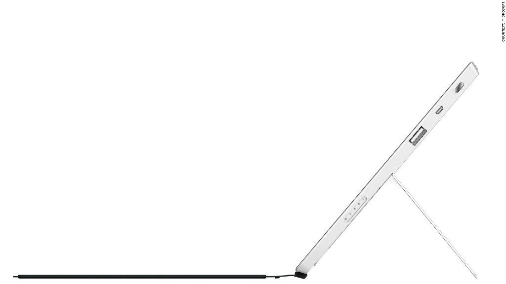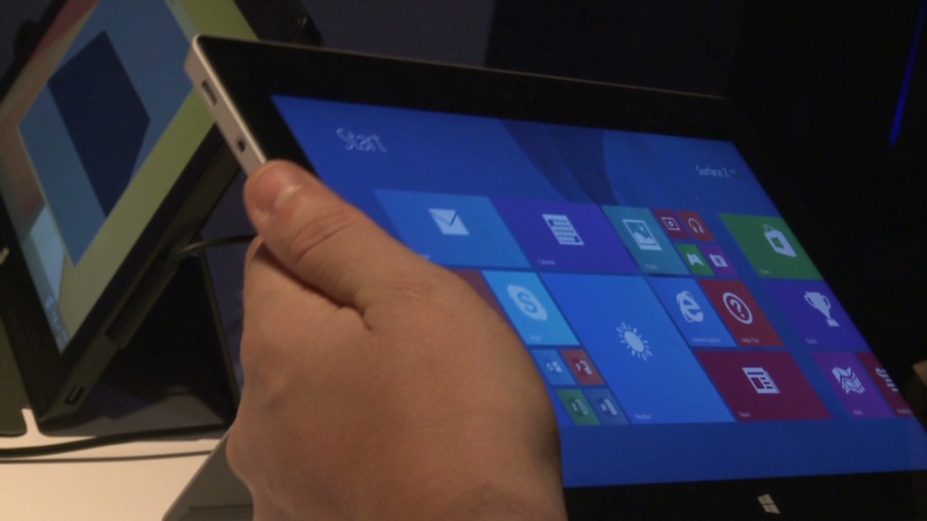
The Surface 2 from Microsoft (MSFT) is unquestionably improved over its predecessor in every way.
That said, it's still not quite ready to challenge Apple (AAPL) and Google (GOOG) for tablet supremacy.
Microsoft's hybrid device is thinner, lighter, faster and has the same lovely 1080p display as the beefed-up Surface Pro 2. It is still exquisitely designed. Moving through the Windows RT interface, it feels as fast and smooth as any iPad or Android tablet.
First let's look at the new covers. The Touch Cover and Type Cover are still some of the best innovations to come out of Redmond. It is amazing how thin they are and how they magnetically connect to the Surface. And this time around, the keyboards on both are much better than before.
But the trackpad is still a problem with these covers. Strangely enough, the trackpad on the Type Cover is worse than both the new Touch Cover and last year's Type Cover.
Related: Nexus 7 is the best Android tablet
Besides the fact that they're too small and unresponsive for more advanced computing, they still primarily react to where you're clicking or touching the trackpad instead of responding to how many fingers you're using.
Take, for example, dragging and highlighting objects. Instead of letting you swipe with three fingers on the trackpad to grab a file and drop it in a folder, select a chunk of text, or rearrange a snap widget, you have to hold one finger in the lower left hand corner and use another to move the object in question around the screen.
This doesn't seem like a big problem in theory, but given the lack of size and issues with responsiveness (not to mention the lack of a mechanical click), trying to pull these actions off are a hassle. That's why people still prefer to do them on PCs.
Surface screen still not ideal. When used as a tablet, the biggest issue is the screen. The 16:9 display is plenty responsive to your touch, gorgeous to look at and fine when docked to a keyboard and trackpad. But its proportions are problematic when used as a tablet.
Related: Microsoft's latest profits trounced estimates
Most people tend to hold tablets vertically. When you do that with the Surface, it just feels awkward. It's too long and narrow. It's why many large Android tablets -- like the Nexus 10 and Kindle Fire HDX 8.9 -- adopt a less wide screen. Taking that one step further and going with a 3:2 display would be a happy compromise between Microsoft's current screen and the iPad's more squarish 4:3 display.
But the screen issues keep the Surface from being an excellent, or even good, tablet. It's simply adequate. And that's bad news for a device that's supposed to be a tablet first and PC second.
Windows 8.1 is better, but not perfect. The updated Windows RT 8.1 software for the Surface 2 has many needed improvements. The enhanced functionality of the snap widgets and integration of notifications offer a glimpse at how the Surface could help to define the future look and feel of computing.

Having Twitter or a music player permanently docked next to Internet Explorer is convenient. Stacking 4 apps next to each other in an external monitor is also nice. It makes you glad to not be using a PC with traditional windows.
But even if there are lots of good theoretical ideas, Windows 8.1 still doesn't feel entirely intuitive. Too many of its advanced features are often discovered by mistake -- or in my case, by frequent Googling.
Another big problem is how you interact with the hardware and software. There's no reason why users shouldn't be able to easily control every aspect of Windows with the keyboard and trackpad of the touch cover or type cover. But far too often I found myself going from using the keyboard and mouse to touching the screen in order to switch apps. This will frustrate most people.
Where are the apps? Another major roadblock is the lack of RT apps. Microsoft's app store is better than it was this time last year. Facebook, Twitter, Netflix, Hulu and Kindle now all providing their services in RT form.
And while apps are a little less crucial on a tablet than a phone, missing official apps from the likes of Spotify and Pandora and the entire Google suite really hurts. If you buy a Surface and want the best possible experience, you have to be comfortable using Microsoft's solutions for mail, messaging, cloud storage, entertainment, and reading. Not everyone will be.
Related: More of CNNMoney's Best in Tech reviews
Microsoft's "fix" for this issue is essentially the new, pricier Surface Pro 2, which runs a full version of Windows 8.1 and allows you to install all the old desktop apps you're used to. That's a problem for Microsoft.
The Surface Pro 2 is fat, heavy, and has all the same issues with the display size and RT apps that the Surface 2 does. It's also a boring, unimaginative cop out for Microsoft.
Microsoft must make a tough decision. The Surface 2 is the better idea and more closely resembles what computers will resemble in the future, but the Surface Pro 2 is still more functional for the time being. It seems that Microsoft is more worried about not alienating its current (but shrinking) user base than it is with winning over new customers with something more innovative.
This yet again leaves Microsoft in a weird place.
Microsoft either needs to start phasing out the traditional desktop environment in earnest or it needs to keep the two modes walled off from each other. In other words, have the Surface use the traditional Windows when it's docked into the keyboard cover but operate with the new interface when it's disconnected from the cover. Otherwise, devices like the Surface are going linger in a state of tech limbo.
That's unfortunate. The Surface 2 is not disappointing because it's bad. It's disappointing because Microsoft has this truly great idea that hasn't yet translated into a truly great product.

