
The most surprising thing about Hillary Clinton's announcement on Sunday? Her new logo.
It's a sans-serif blue "H" overlaid with a red arrow pointing to the right.
For such a simple logo, it sure has a lot of people buzzing.
Why is the arrow red and pointing to the right? Is she becoming a Republican?
Maybe it's too simple. And doesn't it look a lot like the FedEx logo? Or a hospital sign?
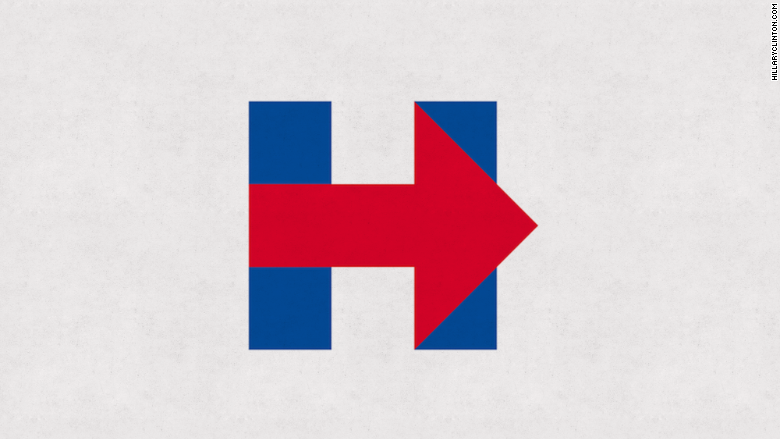
Whatever it's supposed to connote, the reaction on social media has been loud and biting. There is even a Twitter account devoted to the logo.
"I don't understand the emotional violence in response to the logo," legendary graphic designer Milton Glaser told CNNMoney. "It's all a little naive, if you ask me."
Glaser, creator of the "I ♥ NY" logo and co-founder of New York magazine, said he likes the logo. He conceded that it was "a little bit generic," but not too much so. In fact, he said it was "effectively simplified." It gets Clinton's message across and it's memorable -- two crucial check boxes to tick off for any marketing campaign.
"It's an effective piece of graphic design, because it encompasses the idea of her name and the idea of movement," Glaser said. "That's the stated objective of the logo, and it embraces what the campaign wants to say."
Clinton's logo is particularly well done compared to other candidates for office, Glaser said.
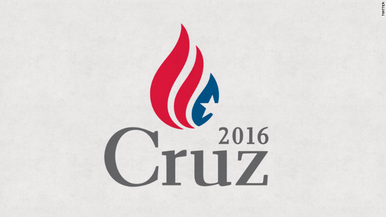
He said he wasn't sure what Ted Cruz's logo was trying to get across. ("Is he advocating flag burning?")
Rand Paul's logo was a bit better, he said, with the liberty torch. But it wasn't particularly memorable.
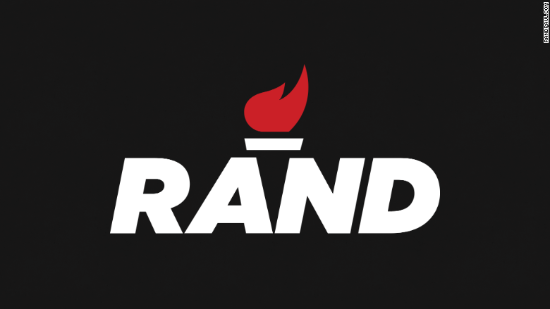
"The basic purpose of an identity is to be memorable," Glaser said. "Of the three, Hillary has the most professional and the most useful logo in order to represent a candidate."
Clinton is betting that her new logo will be more effective than her campaign design in 2008, which read "Hillary for President" with a waving flag underneath.
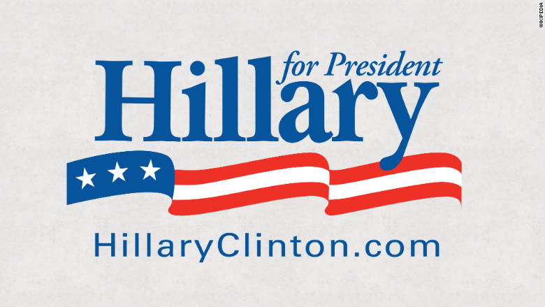
She lost to President Obama, with his iconic rainbow/rising sun "O" logo that is perhaps the most memorable campaign logo in American history.
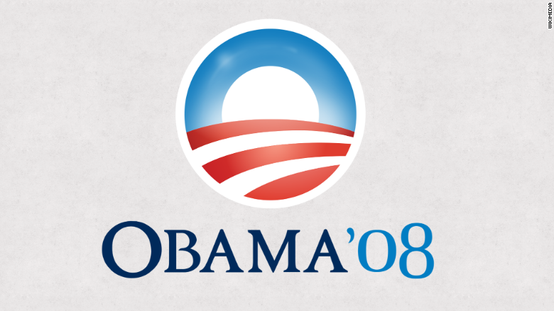
Clinton is hoping that similar simplicity will win this time around.
Glaser said the 2016 logo is better than the Clinton logo from 2008, but only time will tell to determine how effective it is.
"Who knows? Everyone in marketing thinks they know the best way to get the message across," he said.
What's for sure, though, is that Clinton did not rip off the Wikileaks logo.
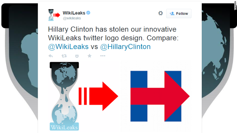
"It's nonsensical; everybody uses arrows," Glaser said. "It was cut into segments and has totally different image, making it a completely different logo entirely. The arrow is one of great clichés in communications, so they shouldn't be so possessive about it. It seems a bit neurotic."

