Everybody puts router in a corner.
It's not just because Wi-Fi routers are unattractive (though most are). We hide them away because where there's a router there's also a nest of cords and aggressively blinking lights.
 |
| Inside Google's new OnHub router. |
Unfortunately, Wi-Fi networks are strongest when routers are visible. The antennas can reach farther when they're out in the open, not blocked by walls or furniture. Moving a router is one of the most effective things you can do to improve your Wi-Fi coverage.
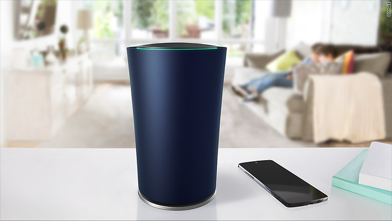
To solve the the ugly router problem, Google (GOOG) has, rather unexpectedly, designed its own router. The Google OnHub is a $199 router that's easy on the eyes and even easier to set up. The company says the OnHub will simplify the set-up and day-to-day management of a wireless network.
I tested one out at home, pitting it against my existing router, an Apple (AAPL) Airport Extreme (which is also pretty good looking, for a router). Speed tests showed the OnHub was a bit faster than the Airport connection (a difference of about 6 megabits per second). OnHub did even better at long distances, up to three rooms away. Overall the difference in network performance wasn't too huge, at least in this limited face-off.
The OnHub is a squat cylindrical device. Outside is a swappable plastic shell that comes in two colors, black and blue. Google says there will be more color options in the future. It looks non-threatening -- almost cool -- and bears more than a passing resemblance to the Amazon Echo.
Yes, the OnHub is attractive enough to leave laying around the house. Unfortunately, it can't do much about the power and Ethernet cords, which discretely slip out the back under the shell. Google did tone down the lights so that the router only glows when it needs to tell you something, and you can adjust their brightness.
What really sets the OnHub apart is its app. Wireless networks are a marvel of modern technology -- you can stream TV shows in the bath! -- but they can also be also messy, temperamental and confusing.
The OnHub app does a good job of using plain language and simplified design to help you identify problems and monitor your network.
You can only set up and control the router using the companion iOS or Android mobile app. There is no desktop or web option. The app walks you through the set up process with illustrations and clear instructions.
It displays how many devices are attached to the network, including how much data each is using. If you want to play favorites, you can set the router to prioritize Wi-Fi for a specific device for one, two, or four hours. Most helpfully, if there's a problem, it helps find out where exactly things are going wonky and suggests fixes.
The app makes it easy to share your network. Instead of pointing houseguests to a piece of paper with your 12-character alpha numeric password scribbled on it, you can share the network name and password directly from the app.
You can even manage an OnHub remotely. Anyone with elderly family members will appreciate the ability to troubleshoot their Internet connections from anywhere.
The OnHub is a Google product, designed by a mix of in-house and external teams. But it's made by a third party -- in this case, TP-LINK. Soon other companies will come out with their own OnHub routers, including ASUS. This is similar to how the company approaches other hardware, including the Chromebook and Nexus smartphones.
For now, the OnHub is just a nice upgrade for a home Wi-Fi network. But there are dormant features that could turn it into much more. It's primed to become a hub for all the connected devices in your home.
It has Bluetooth and ZigBee build-in, though they're not currently enabled. There is no mention of a microphone (sorry Google Now fans), but it does have a 3 watt speaker. Updates happen automatically, so Google could push out any improvements easily.
If Google decided to unleash all the OnHub's powers, it would be much more than a pretty face. And far more likely to score a spot in my living room.
The OnHub is available for pre-orders Monday on Google's website.

