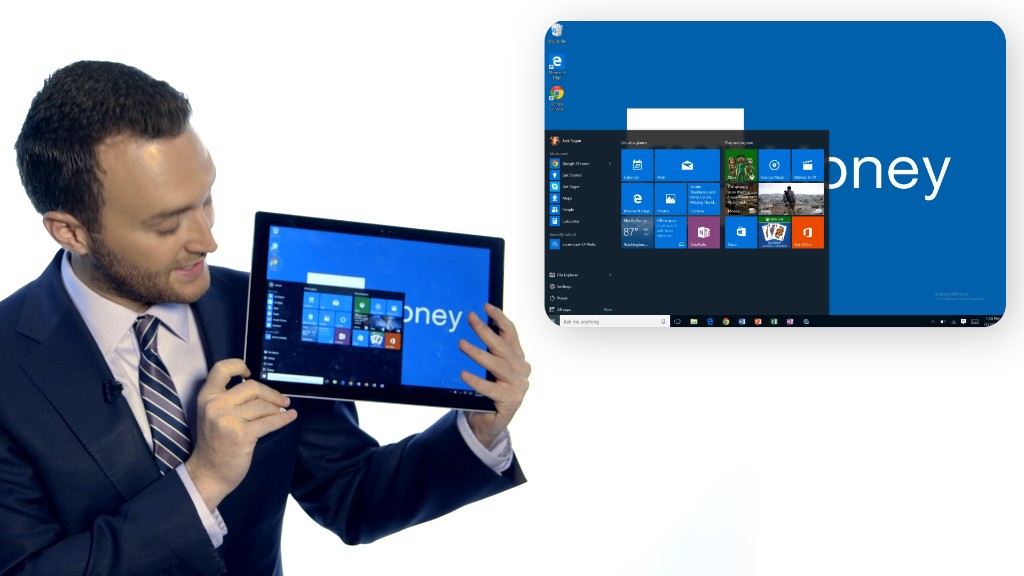
Google's head of design has some choice words for Windows 10.
"#Windows10 ? More like Windows 10 years ago!" tweeted Matias Duarte, Google's (GOOGL) design chief.
Duarte is known for transforming Android's messy look into its new, highly regarded "Material Design" interface. The minimalist series of cards, pastel colors and animations has been a big hit with Android customers.
Microsoft (MSFT) was actually a pioneer of minimalist tile design with its Windows 8 operating system in 2012. Windows 10 still incorporates much of that design sensibility, but its overall interface is laid out more like Windows 7 and Windows XP.
Duarte is not a big fan.
"I just setup a Surface 4 & Windows 10 - not sure why I was excited to try a new thing, it's basically XP with a flat design skin. #FutureNot," he tweeted.
People erupted in anger, as people tend to do on Twitter. Duarte responded that he actually thinks Microsoft has done some nice things recently -- namely the much-loathed Windows 8.
"Man, I struck a nerve! Overly clever tweetbait aside, I've always liked Microsoft was attempting to do with Windows 8 - change the paradigm," he said.
He then further clarified that his issue with Windows 10 is function -- not form.
"I have no beef with how #Windows10 *looks*. I'm disappointed it *works* just like XP. I understand that's a feature for many. Not for me!" Duarte tweeted.
He later noted that "if Android works the same way as it does today in 10 years - I'll be very very sad."
Duarte's comment should be taken with a giant grain of salt. Windows 10 is a completely different operating system than XP, even if it looks somewhat similar. The Cortana voice assistant, virtual desktops, Windows Hello face-scanning security features, the action center, touch support, the Windows store ... the list of how they're different is too long for this space.

