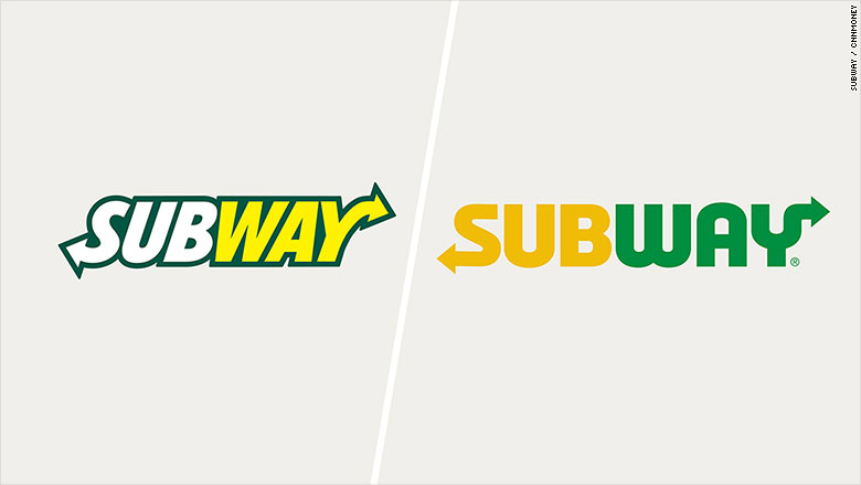
Subway has refreshed its logo to convey that its food, also, is fresh.
The Subway logo, which is the word "Subway" with arrows pointing out of the first and last letters, is now yellow and green without the dark border.
A Subway spokeswoman said the new logo is "a reflection of the colorful array of fresh vegetables and other ingredients" at a Subway shop.
She also said the yellow-green is "a way to refresh our look while remaining true to the brand's roots by using the vibrant color palette of the mid '60s when we were founded."

She said this is first the time the company has changed the logo in more than a decade and it's the sixth time the company has changed the logo in its 50-year history.
Related: 14 logo changes that drove people crazy
The new logo comes after the fast food giant has stumbled in the last couple years. In 2014, the company ran into trouble for underpaying its so-called "sandwich artists."
Last year, its weight loss pitchman Jared Fogle pleaded guilty to charges of child pornography and having sex with minors.

