4 of 5
1982's cult favorite character
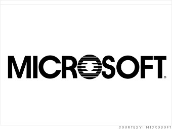
Microsoft's shouty all-caps logo featured a special character that inspired a fan club: the "blibbet," a set of three concentric circles with lines that made up the first "O" in the company name.
This logo lasted until 1987, but at least one Microsoft employee remembered it fondly nearly two decades later. Larry Osterman said the blibbet appeared all over Microsoft's campus in the '80s, from corporate letterhead to binders.
The cafeteria even grilled up a "Blibbet Burger," he recalled in a 2005 blog post. When Microsoft announced it would retire the logo in 1987, a group of employees staged a "Save the Blibbet" campaign. Those efforts failed, but the campaign buttons live on.
- Last updated August 23 2012 04:50 PM ET