If you run an e-commerce website, chances are you've been puzzled, at the very least, by the number of visitors who look at what you're selling and then leave. Wouldn't it be great to turn more of those visitors into customers, just by tweaking a few details?
It's not impossible. Dane Atkinson was a former executive at Squarespace who founded SumAll, a Manhattan firm whose 45 employees now analyze data for more than 150,000 corporate clients, including Starbucks (SBUX), Sony (SNE), HBO and Harvard.
"At Squarespace, we noticed that the things that make a big difference can seem very small," Atkinson said. "For instance, changing the color of a button on our site increased sales. We also found that you can double conversions just by moving some key phrases from the left side to the right."
Based on data SumAll collected, here are 10 tips for turning traffic into sales:
1. "My" works better than "your." "'Start my free trial now' will get more clicks than 'Start your free trial now'," Atkinson says. "The word 'my' suggests to people that it's already theirs, so why not claim it?"
2. If your service is free, emphasize that. Adding "100% free" or "Get started for free" will always help boost conversion. When SumAll added "100% free" to its site's headline, sales jumped by 18%.
Related: Tax season unleashes cyberscams
3. Reassure potential customers that privacy is respected. When asking for an email address, "make sure to clearly state that it's for your eyes only -- for example, 'We won't ever sell your information. We hate spam too'," Atkinson says.
4. Use active phrases on buttons. "Don't ever label buttons with the word 'Submit'. It isn't descriptive enough," said Atkinson. "Instead, make sure the button says something like 'Get instant access'."
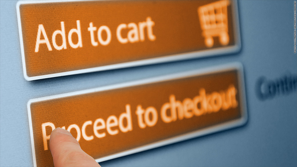
5. Colors matter, and orange buttons encourage people to buy. The reason behind it is a bit of a mystery, but Atkinson thinks it's partly because "sites like Amazon and eBay have so popularized orange buttons that they've become what people expect."
6. Placement matters. On your homepage, make sure images and videos are on the left, while the call to action is on the right. "Western audiences tend to read from left to right, so this simple tweak is surprisingly effective," Atkinson said. At SumAll, this one change boosted conversion by 5%.
7. Personalize recommendations. Use product badges to indicate when something is "new" or a "staff pick" or "just for you." Small as it seems, it goes a long way toward encouraging browsers to buy.
Related: How to successfully launch a second startup
8. Be consistent. Make sure the copy and design of your advertising matches the copy and design of your site, Atkinson advised. "Breaking this continuity, which is a kind of 'scent trail' between ads and online pages, can seriously hurt conversion."
9. Be cautious about using videos. "Those fancy videos startups love can cut both ways," Atkinson observed. SumAll has seen videos discourage conversion as often as they improve it, especially if they're too long. After about 90 seconds, potential customers tend to get bored and wander off.
10. Constantly test what works and what doesn't. Even basics like your company's slogan should be reevaluated. When SumAll changed the tag line on its site from "The world's best tracking tool" to the friendlier "All your social media in one place," conversions shot up by 60%.
Correction: A previous version of this article misstated Atkinson's involvement with Squarespace. He was the CEO, not a cofounder.


