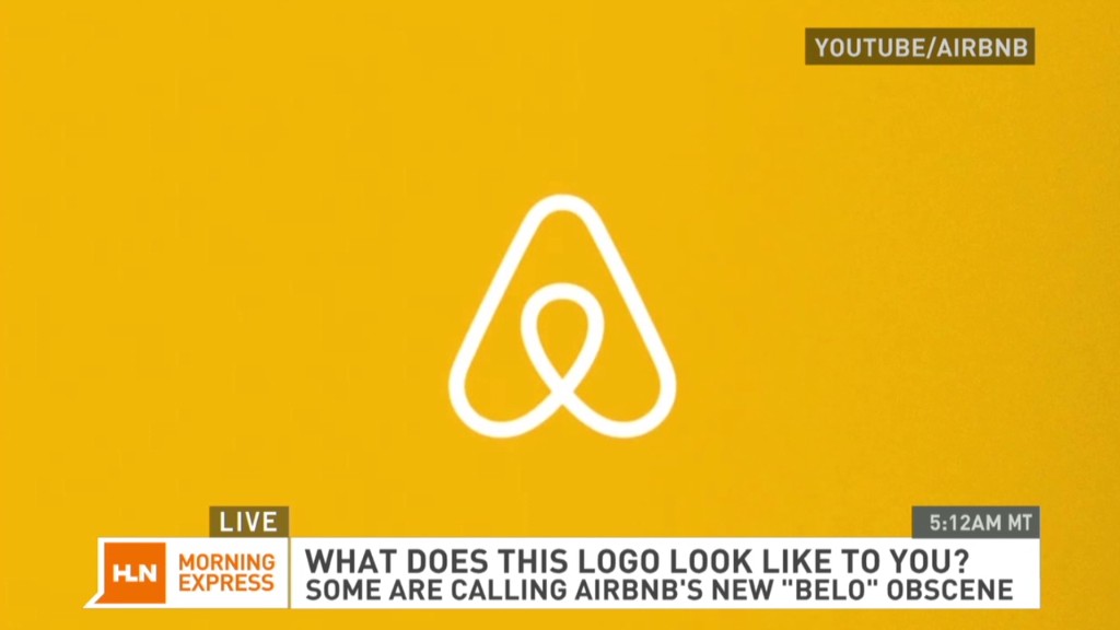
Airbnb released a new logo Wednesday, and it looks like a ... well, judge for yourself.
The online rentals site said the new logo, dubbed "Bélo," is supposed to convey a sense of "belonging." Plenty of people on social media aren't seeing that. No. They're looking at those two bulbs dangling, that circle-within-a-triangle design and saying what your middle schooler and your psychotherapist were both thinking: That looks like genitalia.
The Internet seems split on whether it's male or female genitalia -- or both. Breasts and a rear end have also been discussed.
But reaction on Twitter has been fairly unequivocal: Something's amiss about Airbnb's new logo.
"looks majorly obscene," @LouiseMensch tweeted on Wednesday afternoon.
@TadCarpenter cracked that the "Airbnb's new logo is probably my favorite testicle based logo for sure."
"I think the new airbnb mark is thoughtful and well done, and anyone who says it looks like genitals is just a big weiner," wrote @zohf.
That about sums it up, doesn't it?
Airbnb explained in post on its website that new logo incorporates symbols like an upside-down heart, a mobile map-app pin (in the center) and a letter A for Airbnb. They wanted the logo to be simple to draw so that users can post the logo as a welcoming gesture.
Related story: Warren Buffett endorses Airbnb
The company has had some fun with the whispers. While it's mostly been tweeting out thanks to those few who complimented the logo without going blue, Airbnb did respond to @joeshoop, who wrote that the new "logo looks like a weird butt."
"We prefer well-rounded," @Airbnb tweeted.
The company did not immediately respond to requests for comment.
Airbnb is no stranger to controversy: Lawmakers in New York and San Francisco have contended that the site violates laws that govern rental agreements. In May, after six months of legal wrangling, Airbnb agreed to turn over a chunk of user data to New York State's attorney general.
The company is reportedly worth $10 billion, more than all but three of America's hotel chains.

