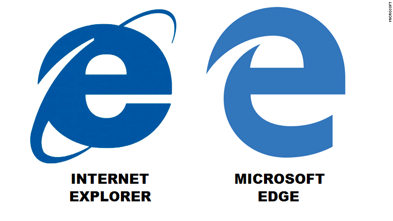
Does the Microsoft Edge logo look familiar to you?
Microsoft's (MSFT) new Edge browser was supposed to mark a break from Internet Explorer. Yet the Edge logo, added to a preview version of Windows 10 on Monday, looks unmistakably like the beleaguered browser it is supposed to replace.
The famous blue "e" with the orbital rings around it has symbolized Microsoft's Internet Explorer browser since 1996 (IE 3 was the first version to sport the logo). But in recent years, the "e" has become synonymous with bugs, security problems and outdated technology.
When unveiling Edge in April, Microsoft operating systems chief Joe Belfiore noted that Edge would have an "e" icon, but he said it "now has a completely different and better meaning than it has for a while."
Edge is a definite improvement over IE. It's noticeably trimmer than IE, without the sea of menu options and bells and whistles. Settings are mostly straightforward and super-slimmed down -- just the bare essentials. Edge has a clean, modern look, similar to Google's (GOOGL) Chrome browser. You can mark up and annotate websites using Edge, and Edge integrates some of the powers of Microsoft's digital assistant, Cortana.
Keeping the Edge logo is consistent with the way that Microsoft is treating Windows 10. With the new operating system, which is set to debut on July 29, Microsoft is trying to make the software familiar to people who are longtime Windows users who were spooked by the radical design change of Windows 8. But the company is also integrating vastly improved features that will make Windows 10 more than just an "everything old is new again" operating system.
Whatever you think of the new Edge logo, it's a noted improvement over the temporary logo Microsoft had given its new browser before deciding on its official name.
When Edge was known as "Project Spartan," its logo looked something like the World Bank's logo crossed with Toyota's symbol.


