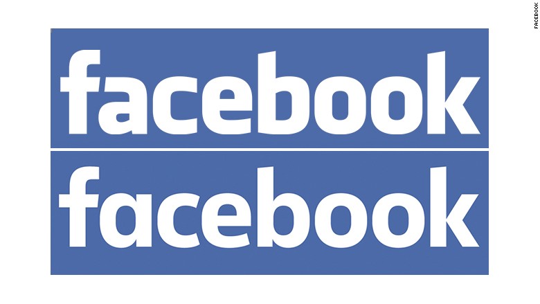
Brace yourself. Facebook (FB) has quietly updated its 10-year-old logo, switching to a new custom typeface.
The redesign is mild enough that most non-designers probably won't notice. The letters are thinner and have a bit more breathing room. Overall, the logo has a little less character (ha), but is still the same recognizable all-lowercase white and blue. The most noticeable difference is probably the different style of "a."
Facebook's creative director Josh Higgins told the blog Brand New that the modernized logo was meant to be "more friendly and approachable."
The redesign only applies to places where the full word "Facebook" appears, like on the main Facebook web page, signage around campus, and Mark Zuckerberg's business card. The square F logo and app icon will look the same. The new Facebook logo won't even be readily visible to the millions of Facebook users who access the social network on a mobile device, since it doesn't appear in the main news feed view.
Large companies are constantly updating their logos, usually with little or no fanfare. But sometimes it gets interesting.
When Yahoo redid its logo in 2013, it managed to turn the unveiling into a month-long publicity stunt. The final result was a letdown -- still purple, still had an exclamation point, not comic sans. Gap (GPS) tried to update its 20-year-old white-on-blue logo in 2010. Armchair design critics on Twitter and Facebook attacked the clothing company's minimalist new logo and Gap was forced to revert back to the original.


