Google's logo just went bigger in order to look better smaller.
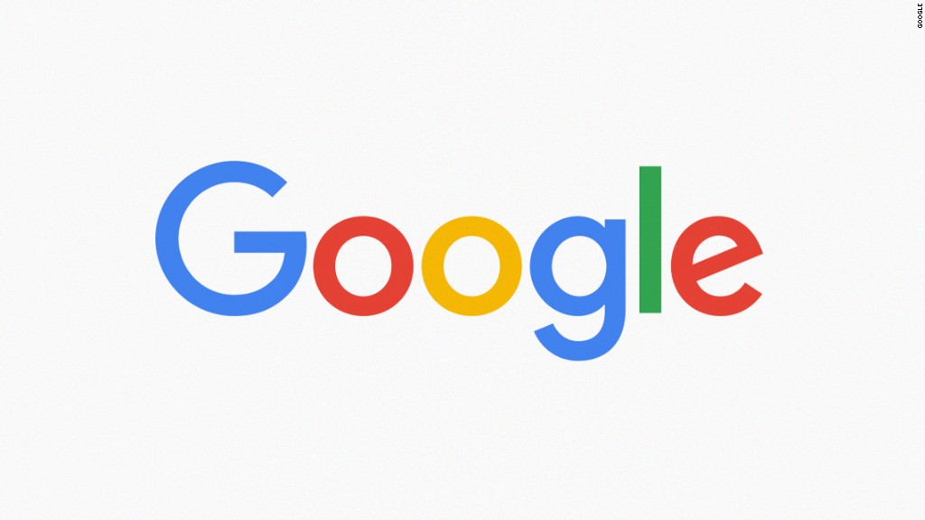
The company made a major change to its logo Tuesday. It's keeping the same color scheme (but brightening it) and switching to an entirely new typeface. The custom typeface is now sans-serif and thicker. It's the same typeface that Google's (GOOG) new parent company Alphabet is using for its logo.
The makeover has a practical motivation. This kind of lettering is easier to read when shrunk down, as Google products increasingly are on mobile devices and wearables.
The new branding replaces the last Google logo, which the company has used since September 2013.
"We've taken the Google logo and branding, which were originally built for a single desktop browser page, and updated them for a world of seamless computing across an endless number of devices," said Google's Tamar Yehoshua and Bobby Nath in a blog post announcing the change.
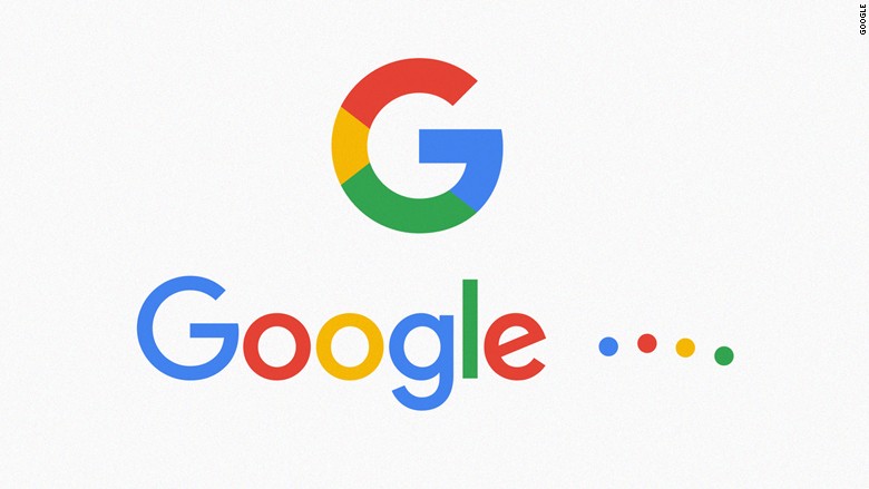
In addition to the new static logo, Google created an animated set of four dots that show up when a Google product is processing. Google also unveiled a new multicolored "G" logo for places where the whole company name won't fit.
The logo was created earlier this year during a one-week collaboration between various Google designers. They wanted to create a smaller version of the Google logo for tiny screens, add some movement and have a consistent look across Google products, according to a detailed post about the redesign.
"The Google logo has always had a simple, friendly and approachable style. We wanted to retain these qualities by combining the mathematical purity of geometric forms with the childlike simplicity of schoolbook letter printing," said the post.
Google should brace itself for strong reactions. Many big companies have struggled with rebrandings. Gap (GPS), Coke (CCE) and Hershey (HSY) are just a few of the brands that switched back to their classic logos after negative receptions.
"It's just a disaster," said Ina Saltz, a typography expert and professor at CCNY. "It looks childish, it looks unsophisticated, it looks like play dough."

Saltz says the spacing between the lowercase "g" and "l" is too tight, the bottom "jaw" of the upper case G sticks out too far, and there's a dissonance between the angle of the lower case "e" and the first "G." Instead of switching typefaces completely, Saltz said Google would have been better off beefing up the existing logo to work better on small screens while keeping its overall look.
"You have a built up recognizability and a constituency that recognizes your distinctive logo," she said. "This has nothing distinctive about it."
This is Google's sixth logo since the company launched in 1998. Most of the updates have been subtle. Over the past 17 years, Google has made only two drastic changes to its official branding.
In October 1998, Google change the color of the "G" from green to blue and added an exclamation point at the end. Google removed the exclamation point the following May.

