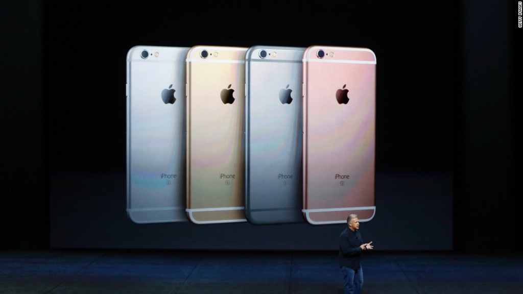
Apple's new iPhones, that giant iPad Pad Pro, and the completely overhauled Apple TV aren't available until later this year, but I was able to get my fingerprints all over the shiny new goods.
Here's a peek (and a pop!) at what's coming.
iPad Pro
On paper, a 12.9-inch iPad sounds like a slam dunk. Who doesn't like bigger and better screens? But when you first see the iPad Pro next to a human, it is startlingly huge.
Apple (AAPL) employees made it look easy to hold one in the palm of one hand while swiping with the other. One described it like holding a magazine. I managed not to drop one and shatter the screen.
It's light enough, just 1.57 lbs, but the slick Apple hardware design means there's no traction on the iPad Pro, nothing to hold on to but smooth metal. I think it's too unwieldy to use a naked iPad Pro suspended in the air like that, unless you have very large non-slip hands or work on the ISS.
It's not just gravity. As the name implies, the iPad Pro is designed for productivity. If you're working on two iPad apps side-by-side (a very neat feature) you'll want to have both hands free.
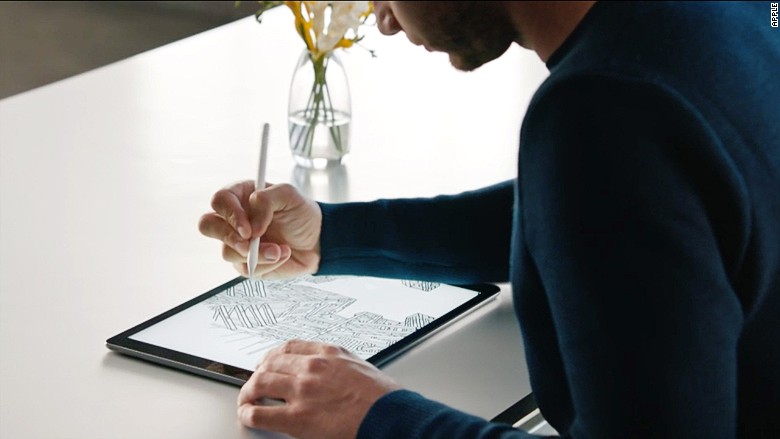
For creatives using the Pro as a designing or drawing surface, it makes sense to just plop down it on a table. But I imagine it will work best safely ensconced in cases with traction or handles, or mounted in special stands. Or, more likely, propped up with a keyboard in front of it (Apple's making its own attachable "Smart Keyboard" cover, just like the Microsoft Surface).

Apple Pencil
The Apple Pencil is classic Apple marketing. They took an existing product, the stylus, dipped it in the special Apple design sauce, and gave it a $99 price tag.
I used it to doodle and practice my cursive. It didn't have as much pressure range as I was expecting but there was no delay that I noticed. You can rest your palm on the iPad while using the stylus. The iPad will detect that it's your hand and ignore it. The coolest feature was an on screen ruler that you control with your other hand while making a straight line.
The pencil plugs in (awkwardly, but I guess it's nice not to need a cord) to the iPad Pro's lightening port for charging. The pencil was a bit slick to hold, and the tiny cap seems destined to get lost. There's no place on the iPad to stick the stylus, and it appears there isn't any storage option on the official Apple silicon case either.
The device is optimized to work on the iPad Pro and is not compatible with other iPads at this time.

Apple TV
The remote is the Apple TV's big centerpiece. Skinny and lightweight, it's part remote and part game controller. It has a built in accelerometer and gyroscope, for Wii-like powers. It has four buttons and volume controls below a touch surface.
I turned it on its side to drive a car and swiped left to right to browse through photos of houses for sale on the Zillow app. Press the dedicated Siri button and a limited version of the voice-assistant will help find and control content. Siri only works with iTunes, Netflix, Hulu, HBO and Showtime apps at the moment, and doesn't appear to have some of the typical Siri features in the iPhone like Googling facts.
One big disappointment is that while Siri gets a dedicated button on the remote, there's no "Hey Siri" powers in the Apple TV. Hey Siri is the hands-free version of Siri on the iPhone. If the Apple TV could be triggered with the key phrase, it could easily stomp out Amazon's Echo.
Other fun details: Apple TV apps will be able to work with the Apple Watch, multiplayer games can be played with anyone on an iOS device, and it works with third party MFi controllers, including a Garage Band guitar.

iPhones with 3D Touch
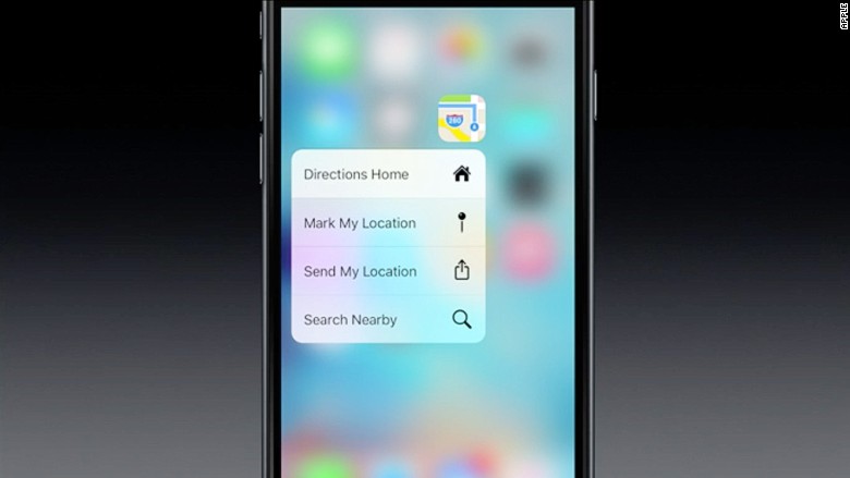
Apple has come up with some adorable terms to describe the new pressure-sensitive touchscreen features on the iPhone 6S and iPhone 6S Plus. When you press the 3D Touch screen, you get a "peek" at what's going on in an app or email. For example, press down on the Facebook (FB) app icon and a little window will give you options to search, check-in, take a photo or update your status. Press on a user in Instagram and get a "peek" of their other photos.
Press harder and you "pop," which is code for actually selecting something. The screen doesn't actually press down or click, but a vibrating haptic engine gives you a little jiggle so you know it worked. I had to press down harder than I though to get either feature to work, and am not sure they address any great needs I have, but the interface looks great.

