The Kindle Oasis is not solar-powered or waterproof. It won't last for 20 months on one charge and it doesn't have Bluetooth.
Those were just some of the rumors swirling ahead of the latest Kindle's release. Any one of them might have justified the device's very real $290 price tag. Instead Amazon (AMZN) made a lighter, smaller and very attractive e-reader whose star feature is a rechargeable cover.
Is it worth the significantly higher price? Should existing Kindle owners rush to upgrade? That depends on your reading habits, expendable income, and how important it is to look cool while enjoying a book.
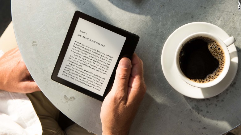
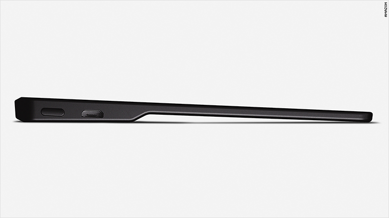
There are a few practical changes. Without the cover, the Kindle Oasis is a little slip of a gadget. It's lighter than the previous Kindle, the Voyage, though it weighs 2 ounces more with the cover. Anyone who physically holds their Kindle up for reading marathons might appreciate the weight loss.
Related: The new Kindle Oasis is Amazon's radical e-reader redesign
There's a thicker spine-like edge that gives you a solid place to grip, but the ergonomics aren't really that different. It does bring back physical page turn buttons, a victory for readers who missed them.
The Kindle has the same Paperwhite screen as the previous model. There are no improvements in contrast or additional features like a warm night mode, but the LED lighting has been tweaked so it's more even.

Amazon says the screen is more durable and has a bit of give, but I haven't heard many complaints about broken Kindle screens. Mine regularly ends up unprotected at the bottom of a bag, covered in keys, crumbs, and heavy computing equipment. It always comes out unscathed.
The best improvement is the new cover, which can extend the battery life to more than two months. Unfortunately, it's compensating for a problem created by the smaller form factor. On its own, the Oasis actually has less power, lasting just two weeks to the Voyage's six.
That might matter less if the covers were a bit more fun. Available in three shades of distressed leather, the magnet covers work great and snap on nicely, but they look incredibly stuffy. On the plus side, they might trick people into thinking you're reading lyrical prose or important nonfiction while you're really downing Beyoncé fanfic.
Related: Amazon: Read as much as you want for $9.99
The worst design is actually on the screen. Kindle recently updated its software across devices, and the new OS is installed by default on the Oasis. The home screen is cluttered with large images of book covers and recommendations for other titles. Amazon (AMZN) says it doesn't make money off Kindle hardware, just from content people buy. So it makes sense for them to push their product, but the final result looks more like a confusing storefront than a bookshelf.
Oasis is the Kindle's first major physical redesign in years. But for many readers, what an e-reader looks like is irrelevant. The Kindle's real job is to disappear. Older Kindle generations, which are still sold by Amazon, may lack the lightness and two-month battery power of the Oasis, but for the vast majority of readers they're still great options that cost much less.

