Out with the old, in with the new.
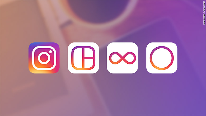
Instagram unveiled its updated app icon, which will feature a simpler camera and a purple, pink and orange color scheme.
The news was revealed Wednesday in a blog post on the company's website.
The changed icon is still inspired by the previous camera whose "rainbow lives on in gradient form," according to Instagram.
Its other apps, Layout, Boomerang and Hyperlapse, are also getting new looks.

The update will extend to the inner design of the app to put "more focus" on the uploaded photos and videos.
Instagram said the new look is a response to how the app has changed since it debuted in October 2010 -- more than 80 million photos and videos are now shared every day.
The way that users navigate the app won't be changed.
Related: Boy wins $10,000 reward for finding Instagram bug
Instagram's head of design discussed the change in a Medium post.
"Brands, logos and products develop deep connections and associations with people, so you don't just want to change them for the sake of novelty," Ian Spalter wrote. "But the Instagram icon and design was beginning to feel, well... not reflective of the community, and we thought we could make it better."
Spalter said the rainbow, camera lens and viewfinder in the original icon were easily recognizable -- an important consideration during the redesign.
"While the icon is a colorful doorway into the Instagram app, once inside the app, we believe the color should come directly from the community's photos and videos," Spalter said of the app's new inner design. "We stripped the color and noise from surfaces where people's content should take center stage, and boosted color on other surfaces like sign up flows and home screens."

