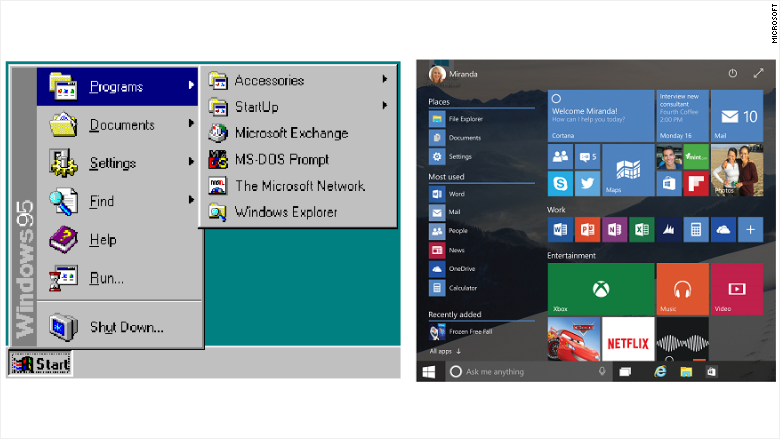
The success or failure of Windows 10 could come down to a single button.
After taking a three-year hiatus, the Start menu is back in a big way in Windows 10, which Microsoft is set to release on July 29. Clicking the Start button in Windows 10 will provide a gateway to the most important and most-used apps on your PC.
As in every version of Windows from 95 to 7, the Start menu in Windows 10 will be where you access all of your programs, organized alphabetically. It also will have quick links to important items like settings and power.
But like Windows 8, the new Start button will also feature two columns of resizable tiles that update with the latest information about weather, social media messages, sports scores, stock prices, your latest photos and more.
First, let's take a tour of the pre-Windows 10 history of the Start menu:
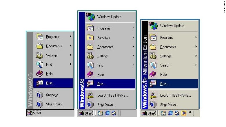
Windows 95, 98 and Me: Microsoft's first take on the Start menu (below) grouped all the PC's program files, documents, settings and power management in one place.
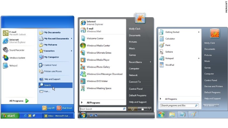
Windows XP, Vista and 7: Microsoft redesigned the Start menu in 2001 (below) -- adding a second column of quick locations. It included an avatar and allowed people to pin their most-used or favorite programs to Start. That version remained in place (with a few tweaks) through Windows 7.
Windows 8: Then in 2012, Start went noticeably absent when Microsoft unveiled its latest operating system.
And customer reaction ranged from confusion to fury.
Microsoft hears you.
But Microsoft (MSFT) also knows that it must get the Windows 10 Start menu exactly right. So it has been sharing iterations of it with anyone who has a preview version of the program.
Microsoft says it's getting close to the final version, but still it keeps tinkering. The latest tweak came on Friday.
Here is what how the development of the Windows 10 Start menu has evolved over the past several months.
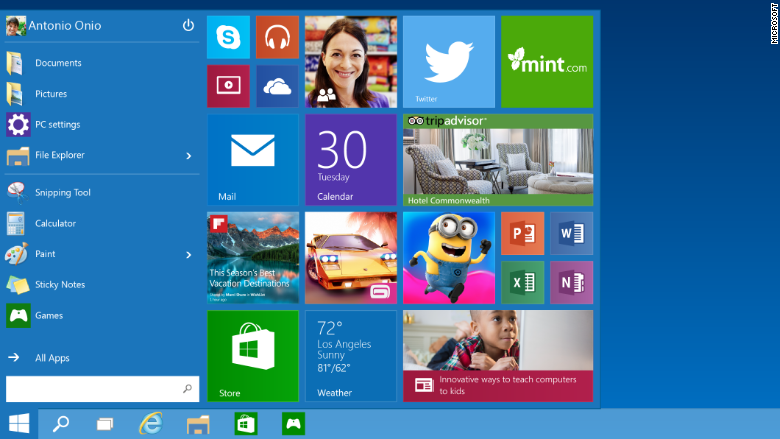
October 1, 2014: When Microsoft first introduced the Windows 10 preview, the Start menu (below) looked like a 50/50 mashup of Windows 7 and Windows 8.
On the left was a virtual carbon copy of the Windows 7 Start menu, and on the right was a replica of the Windows 8 "Start screen" with live tiles.
The location of the power button was the top left, and search was located on the bottom left.
February 16: Microsoft added the ability to expand the Start menu full-screen (below). A diagonal expand button was added to the top right, which is where the power button migrated to.
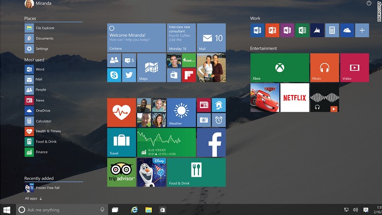
The left-hand column (below) was more clearly divided into "places," "most used" and "recently added" categories, and the arrow for "all apps" was changed from horizontal to vertical.
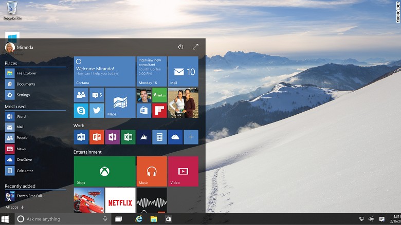
April 30: Microsoft then began to refine the look of the Start menu (below). The power settings moved again, this time to the bottom left. The "places" category and icons were eliminated, replaced with a few lines of text, including "file explorer," "documents" and settings. The "all apps" arrow was swapped out for a new icon.
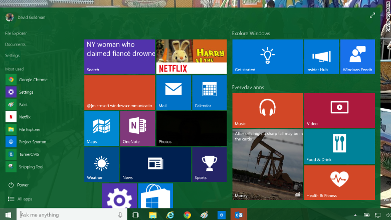
May 29: Microsoft once again fine tuned Start (below). The menu is no longer expandable with the click of a button -- it's now a setting that you toggle. The settings also allow you to customize your experience. For example, do you want recently opened apps to automatically appear there?
Microsoft also once again added buttons for file explorer and settings, moving them below the list of recent apps and above power.
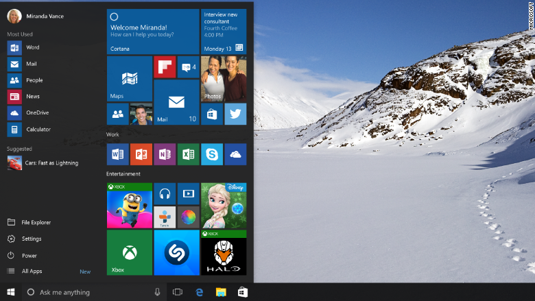
So what now? The Windows 10 Start menu is a major improvement over Windows 8, for sure. But it doesn't feel quite polished.
For example, Microsoft confusingly has put notifications in three separate locations. Want status updates and emails? That's in your Action Center. Want your daily news briefing? That's in Cortana. Want your latest social media updates? That's Start.
Still, Microsoft should be lauded for listening to customer feedback and rapidly making changes. And the best part of all: Even after Windows 10 is released, Microsoft will still be noodling and tinkering, sending out frequent minor updates based on how real users like the product.
Now that's a change we can all get behind.

