Turning Web clicks into purchases
Our website makeover experts help a small-business owner with design and branding changes that will translate into sales.
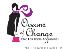


(Fortune Small Business) -- Dear FSB: I have a statistics counter for my Web site oceansofchange.net and although people visit, they are not browsing or purchasing. I am on a very limited budget and am concerned that the layout and text are the problem, yet I don't know how to improve them. Your suggestions are greatly welcomed and appreciated.
- Karen Burke, owner, Oceans of Change
Dear Karen: Our experts agree: Your site is a bore. The absence of colors, features and high-quality photos leaves a lot to be desired, so it's hardly a surprise that the people who make it to you accessories retail site don't stick around.
"When I arrive on the site, I first see a lot of white," says Geeta Punjabi of Raleigh, N.C., Web marketing firm 123Triad. "There is generally too much space on the pages. On the homepage, there is a big scroll, but if it were organized better, it could all fit in one view."
The key to keeping viewers on a Web site is interactivity. The first interactive link on your page takes viewers off of your pages to the Web site of Newport Life magazine (which, by the way, is a site that doesn't load correctly.) And if they don't click that link, vistors are left looking at credit card logos, even though you haven't shown them any merchandise yet - not a great way to build user trust.
"The credit cards are a distraction," says Ryan Menzer, president of FireThread Studios in Glenville, N.Y. "Instead, on the homepage, you should Flash-rotate your bestsellers so that the users can start to see items right away. That will draw them in so that they won't leave as quickly."
Menzer adds that the grainy photos on the top right corner of your homepage give the page a rigid, boxy feel - they're not crisp enough to entice the audience to search for more. If you don't have the technical chops or budget to integrate Adobe (ADBE)'s Flash, you may want to try a scoll-through gallery of merchandise photos.
As for your color scheme, our experts aren't crazy about the purple.
"It's fine in the logo, but it's too bold on the sides," says David Russell of Dallas-based Red Spot Design. "Either make it a lighter shade or a friendly pattern." Plus, he notes notes that the green 'Add to Cart' button on your merchandise pages clashes with the rest of the site's colors.
Punjabi thinks that a small color variation among the buttons on the left can help lift the look of your entire site. She also encourages you to arrange your seals of approval more neatly - perhaps including them below the buttons on the left - so that they can be viewed from all of your pages.
Moving on to the product pages, remember: the image will sell the product.
First, clean up the pages by aligning the thumbnails in neat rows. Then, reshoot or adjust your product photos so that they are all clear shots on backgrounds of the same color. (Menzer suggests white.) Finally, invite users to interact with your products.
"Keep in mind that people love to play," Menzer says. "When they click on a product, they should see a very large, inviting image. A gallery for each product would be great, so that the user can see the product from different angles. And of course, as a fashion site, it would be nice to see how these products look on models."
Punjabi and Russell both think tagging products with keywords such as "discount," "sale," or "special" will also encourage the viewer to look at more closely.
And now, on to the buying process. Your checkout system routes users to an external site. (Clicking your Authorize.net verification seal leads to an "unable to verify" message, which is likely to spook customers.) Going offsite to pay for goods makes some buyers nervous. Experts recommend picking an e-commerce solution that integrates with your site and appears as a seamless part of the shopping experience.
If you do need to use an external payment system, Russell recommends sticking with a widely recognized one like eBay (EBAY, Fortune 500)'s PayPal. Another alternative is Yahoo (YHOO, Fortune 500)'s Checkout Manager.
Menzer points out another big problem at the checkout point: the lack of a security policy to reassure customers nervous about handing out their credit-card details. "Without a 'terms and conditions' page, don't expect sales," he says.
While you are working on these aesthetic changes, there are other aspects of your site you can tweak to optimize traffic.
You want to highlight fashion and fair trade, but there isn't much of a correlation between your products and your branding. Remember to insert key phrases into the text on your pages so that search engines know what you are about.
"The title tag on the homepage should have keywords that can improve your listing," Punjabi says. "When someone searches for 'handbags' or 'scarves' in a search engine and the title of the website is 'Oceans of Change,' the user may skip over it, because they'll think it's related to geography or some other, unrelated topic."
Though you don't want to plaster the words "FAIR-TRADE HANDBAGS" all over your site, you should make it an unmistakable heading on the homepage. Punjabi also recommends changing the titles of each of the pages to have descriptive words such as "silk scarf" and "knit scarf," or "necklace" and "pendant." Another way to emphasize the fair-trade aspect of your business mission and attract fair-trade enthusiasts is to get reciprocal links at fair-trade directories and blogs.
And finally, clean up your URLs. Your product pages are identified by numbers instead of product names. The links in the footer of your pages include go to "oceansofchange.citymax.com," while your side links go to "oceansofchange.net." That kind of inconsistent branding confuses both users and search engines.
Keeping a retail site up-to-date aesthetically and technically can be a daunting task, but when your business model depends on convincing visitors to open their wallets and spend money, it's essential to gain their trust by investing in an attractive storefront. Just as window displays lures shoppers into a bricks-and-mortar stores, your homepage needs to immediately draw in shoppers and hook them on the accessories you've sought out from around the world.
In our "Website remedies" feature, Fortune Small Business enlists Web marketing and search-engine optimization specialists to analyze small-business Web sites in need of an overhaul. Could your site use a makeover? E-mail us at fsb_mail@timeinc.com. Plus, share your tips for improving our featured sites in our discussion forum. ![]()
-
 The Cheesecake Factory created smaller portions to survive the downturn. Play
 -
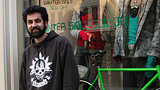 A breeder of award-winning marijuana seeds is following the money and heading to the U.S. More
 -
 Most small businesses die within five years, but Amish businesses have a survival rate north of 90%. More
 -
 The 10 most popular franchise brands over the past decade -- and their failure rates. More
 -
 These firms are the last left in America making iconic products now in their twilight. More