'My online store gets just one sale a month!'
We enlisted e-commerce experts to help a bricks-and-mortar retailer make the transition online.
 |
| Melange owner Joanne Versaggi, pictured in her store. |
 |
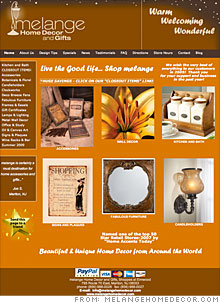
| Melange's online homepage |
 |
| Cute widgets, like this "send this page" link, are often unnecessary distractions to online shoppers. |
 |
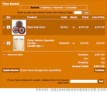
| Melange's shopping cart can confuse buyers who don't know what to expect next, the experts say. |
(CNNMoney.com) -- Dear CNNMoney.com: I have owned and operated a retail storefront for the past three years. I recently launched an online e-commerce Web site. I have paid an SEO guy each month and have aggressively marketed the site, but I'm only getting one sale a month. I am losing faith in all of the work, time and effort that has been put in. Do you have any suggestions on how to jumpstart the e-commerce portion of my business?
- Joanne Versaggi, M�lange Home D�cor, Marlton, N.J.
Dear Joanne:
"When people shop in your store, good customer service can make up for poor merchandising, out-of-stock items, and non-competitive pricing," says Pamela Swingley, founder of Savvy Internet Marketing in Orinda, Calif. "But online, you can't step in and make the sale right. You have to automatically deliver a welcoming customer experience, or shoppers will click away to your competitor."
Your site needs some work to ensure that feeling of "warm, welcoming and wonderful," comes through to your customers. Let's start with the aesthetics of the site, which help visually translate your brand.
Paul Janowitz, founder and CEO of Sentient Services in Austin, thinks that you should make better use of your front page.
"The huge banner at the top and the tagline below the horizontal navigation bar take up a third of the space on the screen, which pushes product images down," he says. "You want to get your products up higher."
In order to display your merchandise more prominently, get rid of any extra images or text. "Credit cards, the white tagline text above and below the images, and 'Send this page to a friend' distract from the merchandise," says Swingley.
Swingley and Janowitz also think you should change your page's colors. Right now, decked out in shades of brown and orange, the site looks trapped in an eternal Thanksgiving celebration.
"Merchandise looks better against a white background, and black or dark gray text is easier to read than white," Swingley says.
Think about the buying experience at a retail store - it's easy, and we all know what to expect. The online experience has to be just as straightforward. In your store, it's not.
"The white text under the photos tells you what category the product is from. Click on it and there's information about the pictured product, when really, one would expect to land on the category page," Janowitz says. "That white text under the photos is also in the navigation bar on the left, but although they say the same thing, they take the viewer to two different places. If your site is inconsistent or doesn't flow the way one would expect, it won't instill a lot of user trust."
Another tip to help viewers through this browsing stage is to allow them to see larger images of your products - crucial for the products that have detail work - and to view them from various angles. (A tip from Janowitz: make sure these viewing options are all available on the same page. Tabs are annoying.)
On to the checkout stage. This is where it's essential to gain the confidence of the user. "Is my info safe? Is the site secure? Is there any guarantee? What is the return policy? These are the questions online customers ask," Janowitz says.
In your the category pages, there is a "buy" button next to each item - a premature option considering the customer hasn't seen much information about the product and doesn't have any details yet about the purchasing process. Also, any button that says "buy" should take the customer directly to the shopping cart, not to the product info page.
"It should be easy to hit buy, clearly see the item in the cart and then have an option to go back to shopping," says Janowitz. "Once we make it to your shopping cart, it's hard to go back." There's no obvious link to continue shopping - the "Previous Page" link is hard to spot - and the logo at the top is dead. Traditionally, sites use their logos to link back to their front page.
When someone walks into a store, they know the process. Online, if the buying process isn't intuitive, the customer will bail out and go to a competitor. Another tip from Janowitz: At each step of the checkout process, make sure there is an indicator of what comes next. If there are any surprises, chances are the visitor will hightail it out of there.
Need inspiration? "Take a critical look at your competitors, like CrateandBarrel.com, Overstock.com, HomeDecorators.com, and PierOne.com, which have invested in top-notch online marketing help. Learn from them," Swingley suggests.
You're having trouble turning your site's visitors into buyers. Janowitz's advice for finding the pain points: "[Answer] the following questions: Where is the traffic coming from, how many hits are you getting, how quickly do visitors leave the site and at what point do they leave? If your slow sales are due to low traffic, you'd solve it much differently than if they are due to Web site 'stickiness'."
But let's assume that the lack of sales comes from faulty SEO (search-engine optimization) - if that's the case, Web surfers simply aren't finding your site.
You can do a lot without hiring an SEO expert, Swingley says.
"SearchEngineNews.com, a monthly newsletter, is packed with marketing tools, tips and resources to help you increase your online profitability," she says. "It's worth the subscription fee."
To make your site more search-engine friendly, you'll need to get your META tags up to snuff. You want to be descriptive yet concise in the title, description and keyword tags. In describing your site, avoid words like "gifts," which are too vague and lump you in with every other retailer in the world.
Focus on promotion. You are a local store, so start at the local level. Do press releases for your store events and distribute them through PRWeb. Claim your listing on Yahoo (YHOO, Fortune 500) Local, Microsoft (MSFT, Fortune 500) Live Local and Google (GOOG, Fortune 500) Maps. Actively seek customer reviews on Google, Yelp and Yahoo - they will enhance customer trust and improve your rankings. You can never have too many reviews. Start your link building locally: Find service or product partners that you support, or that support your business, and ask for links.
If you have the time, try contributing design-related articles to local real-estate blogs so that people moving to new homes in your community can get engaged with your store. There are other ways to cheaply publicize yourself, such as offering to guest-write a column for local designers, or writing seasonal home decor articles for a local paper. Always be sure to include a link to your Web site in those publications.
And then, of course, there's your blog, which the experts agree is a great way to get the word out. Swingley suggests that you use your blog to help readers design a wonderful home and showcase your design savvy. A blog filled with regularly updated, unique content will increase Web site traffic and build incoming links.
"One of the great things about this blog is that the content can be very visual. For example, you can show before and after photos where your wonderful products solve real design problems, or you can invite people to send in photos of their design challenges and come up with affordable solutions," Swingley says. "This type of content will attract links, help your readers create a wonderful home, and build your online reputation."
If customers can't easily upload photos or share information through the blog, Janowitz suggests using social media tools such as Flickr.com, MySpace and Facebook to encourage people to get involved.
"Blogs should be full of links that go to the Web pages and the blogs of other trendsetters," Janowitz says. "In turn, those sites can link back to your page. Once you get the ball rolling, customers and others in the industry will come back without being prompted."
In our "Website remedies" feature, CNNMoney.com enlists Web marketing and search-engine optimization specialists to analyze small-business Web sites in need of an overhaul. Could your site use a makeover? E-mail us at smallbiz@cnnmoney.com. Plus, share your tips for improving our featured sites in our discussion forum. ![]()
Makeover: Saving a kosher fish biz from extinction
Help, my new e-store has no traffic!
Boost your e-commerce site's search ranking
-
The Cheesecake Factory created smaller portions to survive the downturn. Play
-
A breeder of award-winning marijuana seeds is following the money and heading to the U.S. More
-
Most small businesses die within five years, but Amish businesses have a survival rate north of 90%. More
-
The 10 most popular franchise brands over the past decade -- and their failure rates. More
-
These firms are the last left in America making iconic products now in their twilight. More


