Psst, wanna buy your birthday?
The more arcane the product, the simpler the sales pitch needs to be. Our expert tips for revamping an unusual e-commerce site.
 |
| Brent Kozlowski, owner, MyDayRegistry.com |
 |
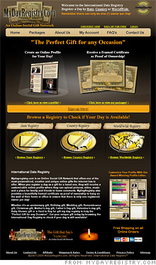
| The home page is dark and the images fail to convey the product. While there is text describing the company, it is hidden at the bottom of the screen. |
 |
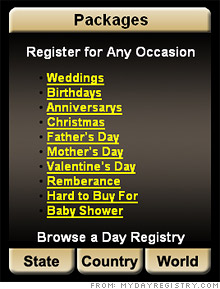
| A list of occasions appears on a secondary page, but would be more useful on the homepage. Promoting each event would help the customer get ideas and enhance search rankings. |
NEW YORK (CNNMoney.com) -- The name of my Web site is MyDayRegistry.com. I have been working on this site for a little over a year now in my spare time, and while it started as a hobby it has grown into a full-blown addiction.
The uniqueness of the product should raise eyebrows and get people to click around the site even if they aren't interested in purchasing. I've tried all sorts of things that the experts suggest to bring traffic like press releases, an affiliate program, and Google AdWords. While those drove traffic, the majority of visitors don't make it past the homepage. I'm afraid that the design of my homepage is not capturing the user's attention or informing them about the product. I would really appreciate the help of the experts in determining why my bounce rate is so high. - Brent Kozlowski
Time is not on your side when you're pitching a product through a webpage. You have just a few seconds after a visitor lands on a page to convince them to stick around.
Your company registers a date in the name of a person or an event. That's an unusual concept, but it doesn't come across right away to visitors. What pops out on your page are the words "the perfect gift for any occasion" and an image of certificates. Those elements are confusing and require more context for visitors to make sense of them.
"You need to be clearer," says Greg Ricciardi, creative director at 20nine Design Studios in Conshohocken, Penn. "Identify exactly what it is and how cool it is."
The text describing your product is "below the fold," meaning that a visitor has to scroll down to read it. The experts want to see it placed more prominently. "At the top, put who you are and what the value is in a big '1-2-3' fashion to show how easy it is," says Paul Janowitz of Sentient Services in Austin.
The next step is to clearly and quickly explain what you offer. Our experts struggled with the concept.
"Are there only 365 days to pick from?" asked Ricciardi.
"Will everyone refer to my day as Paul Day?" asked Janowitz.
Clearly, there's confusion. As you tweak your pitch, be mindful of the language you use. While "day" is a general term and can be recurring (there's "Friday," "Mother's Day," calendar dates such as "January 1," and so on), "date" is more specific and refers to one, unique day, like "January 1, 2009." Refrain from using "day" and "date" interchangeably - you are offering the latter.
"Remember that no one owns a day, but this is a certificate to celebrate a particular date," says Janowitz. "Don't get caught into legalities."
Setting the mood
Your Web site is dark, full of grays and browns. Lighter color schemes are more popular with Web viewers.
"I see you're playing off the colors of the certificate, but it's not friendly. It looks gimmicky, like a late-night infomercial." says Ricciardi. "You need a bright, lively, inviting page to extend their attention span."
"With the dark brown and gold and the lovemaking candles at the bottom - there's a disconnect," adds Janowitz. "The colors you have are more appropriate for a cigar room or a romantic restaurant or a pirate site."
Also, Ricciardi recommends changing the look and feel of your home page to reflect upcoming holidays, so that people browsing for Christmas gifts or Father's Day gifts will have a better chance of finding you at the appropriate time of year.
"Promote four occasions that will remain put - such as birthdays and weddings - and a fifth that will revolve based on the month," he says.
The purchase path
Your site is missing a clear call to action. Although you have text that entices visitors to "Browse a registry to check if your day is available," there is no clear way to do that unless they click on one of three images, for State, Country or Worldwide registries.
That's one choice too many for a visitor who wants immediate gratification. "What do they mean?" asks Ricciardi. "Those three categories are pointless right here." Instead, he wants to see one clear next click for visitors who have decided "this is cool and I want to do it."
If you absolutely need to offer different registries, do it later in the sales process as someone is customizing their order. That's also where you can promote the certificate and custom date Web page. Right now, those features are inappropriately hogging valuable real estate on your homepage.
"Your sales point is registering the day. The plaque and the Web site are just perks of that," says Ricciardi.
Janowitz isn't wild about offering "online profile" Web sites at all. That's a saturated field - if someone already has profiles on other social networking and blog Web sites, why do they need to create yet another one on yours? Either make that feature very compelling and distinctive - a daunting technical and design task - or get rid of it.
Building credibility
To get people to spend money on your product, you need to win their trust. That means your site needs to be easy to use and completely free of typos and errors.
Right now, your search function is temperamental. Visitors sometimes can't tell if their date is already taken. Most of your site's images are too small to see in detail, even in the enlarged photos. Also, glitches abound. On the pages that describe the state registries, the white text - which is generic and fairly useless - gets truncated.
Reworking your site's design and content to simplify it will help both visitors and search engines understand your product. But there are also behind-the-scenes tactics you can implement to boost your search-engine ranking. For example, get key words into your pages, such as "special gift" and "unique gift," to draw people in who may be Googling those terms.
With a bit of effort, you can drive traffic to your site without relying on search engines. "There's a huge opportunity to do more social media marketing, particularly if you promote the holidays," Ricciardi says. "Do banner advertisements on Facebook to tap a lot of people. If you get 10 fans through Facebook and they each have 100 friends, you've just reached 1,000 people."
In our "Website remedies" feature, CNNMoney.com enlists Web marketing and search-engine optimization specialists to analyze small-business Web sites in need of an overhaul. Could your site use a makeover? E-mail us at smallbiz@cnnmoney.com. Plus, share your tips for improving our featured sites in our discussion forum. ![]()
-
The Cheesecake Factory created smaller portions to survive the downturn. Play
-
A breeder of award-winning marijuana seeds is following the money and heading to the U.S. More
-
Most small businesses die within five years, but Amish businesses have a survival rate north of 90%. More
-
The 10 most popular franchise brands over the past decade -- and their failure rates. More
-
These firms are the last left in America making iconic products now in their twilight. More


