Luring local traffic to your Web site
Our Web experts weigh in to help a small law firm market its services.
 |
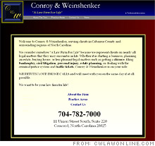
| The home page lacks branding and does not offer any guidance about the contents of the site. |
 |
| These practice areas should be in a sidebar on all pages. Each should hyperlink to more information, such as articles and case studies. |
 |
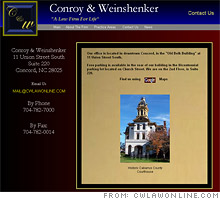
| The image of the courthouse can be a model for a logo and other imagery that will make the site more visually interesting. |
NEW YORK (CNNMoney.com) -- As a small business in a small town, we rely heavily on phone-book advertising for our law firm. We have recently expanded to create a Web site. We have tried to keep it informative to draw in potential clients. We currently use Google AdWords and are listed as a member of the AARP Legal Services Network. Can you make any suggestions as to how we can improve our Web site to attract people who are using the Internet to search for an appropriate attorney in this area?
- Myra Hollifield, Conroy & Weinshenker, Concord, N.C.
You start off with one big advantage: targeting a well-defined audience.
"Attracting local search traffic is much easier than optimizing a Web site for a national or international audience," says Pamela Swingley of Savvy Internet Marketing in Orinda, Calif. "Local search is starting to really heat up."
There are three key elements you'll need to focus on: content, search-engine rankings and design.
You're off to a good start with content. "The best thing to do is to step back and think of the top three things a client would want to see on the site," recommends Tom Grant, executive Web producer at Blue Ray Media in Denver.
Your site highlights the areas of law that your firm practices, but you should build upon that to give visitors more information. "Potential clients will want to know if you have handled situations like theirs. The site should help them answer that question," says Grant. "Some areas of the site start to answer that question, but each could go further by offering details of each area of practice."
Your "Bankruptcy" section, for example, explains what it is and how it affects people. But other topic areas, such as "Estate Planning," provide no such information. Grant thinks you should bring each practice-area page up to the level of your bankruptcy section -- then take each a step further by creating a topical "client stories" page. There, you can give prospective clients a sense of what a typical case you handle looks like.
"This will help them see where you were successful, giving them a better chance to call you if the case sounds like theirs," he says.
Expert tips
Another way to build out the practice-area pages is by providing articles for each. Many in need of legal advice will first try to find answers on their own. If you publish articles, potential clients will appreciate the free information and also have a higher regard for the lawyers who wrote them.
"They think, 'If she writes about this stuff, she must know what she's talking about,'" says Grant. "You position yourself as an expert."
Linking to useful resources will also help build your credibility. Your "Bankruptcy" page links to a recommended credit-counseling class and explains the process of obtaining a completion certificate. That's a great model to follow on other pages. For example, you can link visitors to the site where they can pay local traffic tickets, or to a page with detailed information on North Carolina's divorce laws.
To keep the content fresh, try to update at least one article each month. That has a bonus advantage: It tells search engines that your information is timely and relevant. You could also repurpose your articles into content for a newsletter sent out regularly to subscribers.
"Your tagline is 'a law firm for life,' so you should make sure your services go beyond serving prospective and existing clients," Grant says. "Some clients may not realize you have these other areas of practice, so this will keep them aware that you're still there."
Helping the search engines
Expanding your content will also enhance your search engine optimization (SEO). That's because your articles and links will be full of key words that search engines look for when ranking sites.
Grant's firm, Blue Ray Media, has worked on many law firm Web sites and has tracked the "points of entry" into those sites. "We found that articles with statistics and stories are typically where people jump into the site, particularly with the law firms that update their news and articles regularly," he says.
You can also beef up your SEO by reorganizing your site's pages. For example, your "Practice Areas" pages are the most informational part of your site. In order to emphasize their importance to both search engines and visitors, Grant suggests listing all of them in a sidebar that appears on every page of your site, including the home page.
Keep in mind, however, that broken links on any of your pages will both deter clients and trip the search engine crawlers that read your site. Right now you have several broken links -- and the "News" link in the navigation bar is the same as your "Contact Us" link, which is confusing.
"It looks like you don't care and that you're not detail-oriented," says Grant. "I definitely want my attorney to be detail-oriented."
Cornering the local market
Your site's "meta" tags describe its content. A good first step to capturing local traffic is to include your town -- Concord, N.C. -- and your nearest metro area, Charlotte, in all of your keyword and title meta tags.
You are listed in the Super Pages and Yellow Pages online, and in local search tools from Google Maps and Yahoo Local, but you're not ranked very high in any of those places. To boost your visibility, you'll need customer testimonials and more "inbound" links to your page from other sites.
You can go beyond the traditional search engines by establishing yourself on locally-focused sites like Yelp, Judy's Book and Citysearch.
"When it comes to selecting something as important as legal services, references are key," says Swingley. "It's critical that you monitor what others are saying about your services and that you help your reviews along. Do all you can to encourage your clients to write a review."
Swingley suggests reciprocating links with any community programs and associations you belong to, including the Chamber of Commerce or the local Better Business Bureau. Also, try building relationships with local bloggers and your local TV station's site.
"You can never have too many quality links," she says. "If the firm is mentioned in the press, ask for a link to the site. Exchange links with professionals that refer business to you and include your Web site link whenever you answer a question on boards such as Yahoo Answers or law-related forums such as InjuryBoard.com."
Design
The job isn't over once you get traffic to your site. All the links and information in the world won't score you a client if your site looks messy and unprofessional.
"The overall design doesn't do the firm justice," says Grant of your current site. "Pick a simple theme and stick with it."
Your homepage is bland. It's the "cover" for the rest of the site, and it needs to shine. The first problem Grant notices is the color scheme. You use a lot of colors -- gold, black, blue, gray, yellow, white and red. "Stay clear of the heavy, dark layers," he advises. "Try to stick to two or three colors, such as a blue with white and gold highlights."
Jazz it up with some images, and reorganize the information you present there so that clients can jump straight from your homepage to the information they're seeking.
"The homepage has basically no hierarchy. Nothing is more or less important than anything else," says Grant. "It's a jumbled mess graphically and there's no emphasis on what people might want to do on the site."
Grant noticed only one image on your site, the courthouse pictured on the "Contact Us" page. He recommends simplifying that image and using it on every page, perhaps along with the C&W logo. This will provide a consistent theme and a context to help people relate to your firm.
Also, make sure that top navigation tabs don't disappear as visitors move through your Web site, as currently happens in a few places. Also, keep the tabs on it consistent on every page of your site.
On the secondary pages, try to include images where they're relevant, especially next to the bios on your "About the Firm" page. "It's generic without any people on it," says Grant. "Photos of attorneys and staff can make it more memorable."
Fix those bio pages so that you give visitors what they expect. It looks like each hyperlinked employee name will lead to a bio page, but right now, only the attorneys have actual bios. The rest of the names lead to a page full of empty boxes.
When the aesthetics are fixed, you can add elements to your site that will help the visitors start a relationship with you. For example, create a contact page with a standard form for visitors to fill in. Let potential clients choose an area of law from a drop-down menu and then type their questions and contact information in other fields. That type of form will provide you with client leads while cutting down on the spam you'd get by listing only a contact e-mail address.
Swingley suggests touting a marketing deal right on your site, such as a half hour of free consulting or a discounted first meeting. Add this offer to your meta-tags description to increase traffic.
"The first thing that goes through most people's minds when they think of engaging with an attorney is that it is going to be very expensive," she says. "Make it easy to get started."
In our "Website remedies" feature, CNNMoney.com enlists Web marketing and search-engine optimization specialists to analyze small-business Web sites in need of an overhaul. Could your site use a makeover? E-mail us at smallbiz@cnnmoney.com. Plus, share your tips for improving our featured sites in our discussion forum. ![]()
-
The Cheesecake Factory created smaller portions to survive the downturn. Play
-
A breeder of award-winning marijuana seeds is following the money and heading to the U.S. More
-
Most small businesses die within five years, but Amish businesses have a survival rate north of 90%. More
-
The 10 most popular franchise brands over the past decade -- and their failure rates. More
-
These firms are the last left in America making iconic products now in their twilight. More


