

Watch: Cadillac ATS: 'Standard of the World' returns
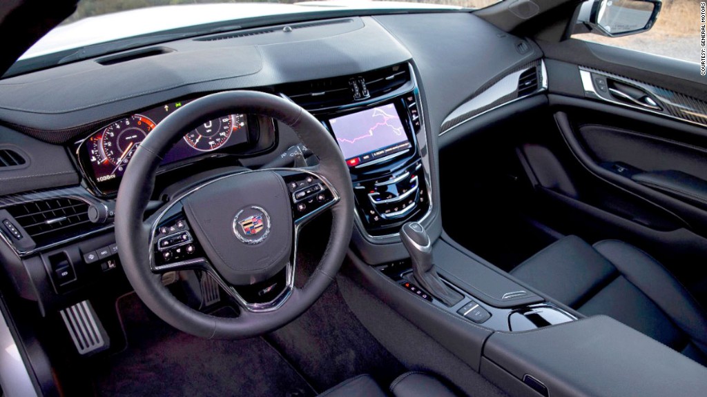
One failure you'll hear a lot of people complaining about is the CUE system, a touch screen for operating navigation and entertainment functions. When your finger correctly lands on a "button" on the screen, it vibrates a little to let you know. Here's a suggestion, though. Why not make those buttons bigger and easier to find and press in the first place?
Also, why not have those buttons visible all the time, not just when your hand nears the screen? Yes, it's cool that the screen buttons appear as your hand nears the screen but... You know what? It'd be easier to remember where they are if you could glance down at any time and actually see them.
The computer-screen gauge cluster -- which can be easily transformed into several different visual styles -- is very nice and fun to play around with. But if you don't pay for that you get a boring, ugly gauge cluster that looks like it came straight out of a 1979 Chevrolet. Luxury brands shouldn't punish buyers for not optioning up.
But, honestly, things are pretty good in here. The materials are appropriately luxurious and the design is outstanding. I'm nitpicking because it's a luxury car. And luxury car owners will pick nits

