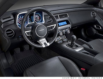
I'll disagree with him there. I found it to be just about dead-on perfect. It's flashier than the Challenger's plain plastic treatment where Chrysler designers managed to hide a few "classic Challenger interior" cues as if they were answers to trivia questions. ("What shape was the gauge cluster housing in an early 1970's Dodge Challenger?")
The new Camaro's interior nicely lifts a number 60's touches, recognizable and enjoyable even to those who are not Camaro-philes. There are the big square gauge housing and the mostly pointless but cool - especially at night - rectangular gauges down low just ahead of the shifter. It all gives the driver the opportunity to share in the sense of drama and excitement the car offers those watching from the outside.
Most impressively, the clever presentation never gets in the way of usability. All the knobs and buttons are easy to find and a pleasure to use. At night, it all glows with warm tech-y blue glow with red accent stripes.
This is General Motors at its best and it's nice to see. It's even nicer to drive.
NEXT

