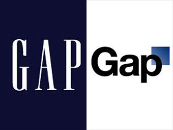
Leaders of one of the country's largest clothing retailers decreed that it was time for a change -- time to ditch the iconic navy square and classy white type for background-less Helvetica type with a tiny blue box behind the "p."
Gap announced the change on October 6 and called their new logo a "more contemporary, modern expression." The only problem: consumers didn't agree. Backlash erupted on Twitter and other social media sites. "It communicates exactly the values currently embodied by Gap: A sense of being lost," sneered Brandchannel. After only one week, the company returned with its tail between its legs and apologized on Facebook: "Ok. We've heard loud and clear that you don't like the new logo... we're bringing back the Blue Box tonight."
For Gap CEO Glenn Murphy, this is one fashion mistake that will be hard to live down.
NEXT: Jobs to iPhone 4 users: You're holding it wrong
