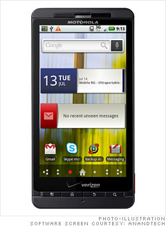
The X launched with Android 2.1, although Motorola emphatically promises that it will update the X to 2.2 in "late summer."
Motorola has rolled a lite version of their Blur interface and skin into the X. It isn't the full-on intrusive Blur that the CLIQ or Devour featured. It's not as much of a reskinning as HTC's Sense, but still does change the UI.
The phone comes out of box with Blur widgets all over the home screens. Literally every single one has Motorola widgets and shortcuts, a number of which I immediately dragged to the trash.
Motorola tries to roll all of your social network messaging into a unified messaging application. It pulls down messages from Facebook and others effectively, but I'm left wondering what use the tool is when Facebook and Twitter offer their own applications and integration. You can inadvertently wind up with two duplicate Facebook icons and inboxes in the messaging app.
But a lot of it is quite tasteful. The clock, calendar, and weather widgets are well done and arguably a bit better than Android's default. The contacts shortcuts are also not bad. They still aren't as nice as some of HTC Sense's, but they're not nearly as bad as I expected them to be. Motorola keeps its widgets in a different tab, so they're not mixed into your main widgets library. If you don't like `em, they're segmented away in a separate menu entirely. Thankfully, most of the Blur additions are pretty minimalist.
NEXT: Skype calls
