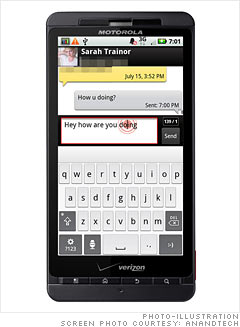
The X comes with two keyboards, Swype and a Blur-customized multitouch keyboard. These are the best keyboards I've yet seen preloaded on an Android device.
The combination of a clean, basic, visual interface and the larger screen size makes the Blur multitouch keyboard excellent. I found myself typing on the X just as fast as I could on other devices right out of the box, despite not having a hardware keyboard. To some extent, the Blur keyboard seems to derive key placement inspiration from iOS, but it has slightly taller keys.
There's a few other things that the Blur interface adds to text input. Start typing, and for the first couple of keystrokes, you'll see a red circle with others around it -- it's a symbol that begs you to tap and hold. Do just that, and you'll get the eyeglass-like cursor place tool exactly like what iOS has. If you long press without the red circle being present, you'll get the normal pop up to edit text and change the input method.
I think this is perfect. It's a ripoff of iOS, but even Jobs acknowledges the value of copying from great artists. In this regard, the Motorola customization offers something valuable.
NEXT: Swype: Unusual and addictive
