Rule #1: Don't terrify your customers
A Web site with aesthetic problems seeks expert advice to keep customers from running away.
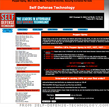 |
| Experts say this site needs to clean up its overloaded text and get rid of its harsh red-and-black color scheme. |
 |
| This sidebar, on product pages, is a good organizational feature. |
(CNNMoney.com) -- Dear CNNMoney: I am the CEO of Self Defense Technology (http://www.self-defense-technology.com/). Please review our Web site and offer any comments that you consider beneficial for us. - John Sellers
Dear John: Your homepage needs a lot of work. The biggest problem: There are far too many font styles, sizes and colors. Amid a jumble of text and links, none stick out.
"You really need to tone it down and make it less heavy-handed," says Cheryl Sarafin of CMS Design Studio in Valparaiso, Ind. "You are using attention-grabbing techniques on every line, which looks amateurish, like a scam site. The copy is disjointed, fragmented and hard to read because it doesn't flow like proper English."
Noam Kerner of Noam Design in New York City agrees that the page needs to be streamlined. "You need to have a good design to get viewer trust," he says.
Both experts believe that it would be beneficial for you to replace the black-and-red color scheme with friendlier hues. Pick your colors based on your target market: "If you're catering to suburban housewives, you want to make sure you're not scaring them away," Sarafin says. Who do you want to buy your security products? Industry professionals? Civilians? Once you identify your potential customer, you can design to their needs.
Stick with one or two colors. Then, organize and simplify the images and the text. Using lots of vivid, alarmist text may seem like a way to inspire urgency in your site visitors, but it's more likely to have the opposite effect, scaring them away from a site that doesn't look professional.
"Keep in mind you only have seven seconds to instill confidence in the viewer before they hit the back button," Kerner says. "So get them focused on something that will keep them on the page."
First, pick the most important elements of your Web site to showcase on the homepage. These should include a logo, a description of your company, and a promotion for one product that can be purchased right away.
"You should never need to scroll down more than one or two screens on the home page," Sarafin says. "Right now, the products are halfway down and difficult to find."
Your whole product line doesn't need to live right on your front page. Instead, focus on just one teaser item and place the rest of your catalog on a designated "products" page.
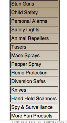
Clicking on a product on your site currently brings up a page that both highlights that product and has a sidebar with links to different product categories. The experts liked that well-organized sidebar, and recommended that you simply transfer it to your homepage and to a products page.
Also, consider commissioning a distinctive logo for your business. Kerner says it's imperative from a branding standpoint to have one, to help viewers identify your company and to visually communicate what you stand for.
When customers click on the button to order a product from your site, they're taken to a new URL ("gunas.com"). That can spook customers who are worried about giving their billing information over to a site they don't recognize. Ideally, your shopping cart should use the same URL as your site, but if that's not possible, warn customers of the change.
"It's disconcerting if you don't know what will happen, so include some verbiage that states these elements are handled by a third party," Sarafin recommends.
You'll also want to make your privacy policy more visible - on a site dedicated to security products, it's an issue your customers are likely to care about. "Having a privacy policy is great, but make sure you place it at the bottom of each product page," Kerner says. "It's not intuitive to find it as a link at the top."
And because you're dealing with potentially harmful products like pepper spray and stun guns, information about their dangers should be included right on the page where the products are be sold. It's also a good idea to information about the legality of the products - can they legally be sold and shipped anywhere in the U.S.? Are minors are permitted to purchase them?
Visitors want to know who they are buying from. An "About Us" link to a description of you and your company would help shoppers learn more about your expertise.
"The Internet is very impersonal," Sarafin says. "You want to make a connection and let the customer know why they should choose you."
Your page's source code has lots of keywords and meta tags. That's a good start, but it won't be enough to make your site visible in search engines like Google. These engines note how many people land on your page and how many stay there. If you can't keep people on your page, Google (GOOG, Fortune 500) won't rank it highly - it doesn't want to send Web surfers to a site where they'll have a bad experience.
One tactic to keep people coming back to your site is to integrate a feedback system: Let users rate products they buy and have discussions about them.
Another way to develop a community is through a site blog. You've already started one, which is a great step, but it suffers from the same problems as the rest of your site: It needs to be toned down. Visually, your blog needs to lose the bold and all-caps text, and editorially, your posts should be written in a direct and conversational tone.
"You have self-defense tips scattered around the site, but these nuggets need to be consolidated so people can find them," Sarafin says. "Then, people will be willing to use your site as an educational resource."
In our "Website remedies" feature, CNNMoney.com enlists Web marketing and search-engine optimization specialists to analyze small-business Web sites in need of an overhaul. Could your site use a makeover? E-mail us at smallbiz@cnnmoney.com. Plus, share your tips for improving our featured sites in our discussion forum. ![]()
An attention-grabbing Web site
Boost your e-commerce site's search ranking
Turning Web clicks into purchases
-
 The Cheesecake Factory created smaller portions to survive the downturn. Play
 -
 A breeder of award-winning marijuana seeds is following the money and heading to the U.S. More
 -
 Most small businesses die within five years, but Amish businesses have a survival rate north of 90%. More
 -
 The 10 most popular franchise brands over the past decade -- and their failure rates. More
 -
 These firms are the last left in America making iconic products now in their twilight. More