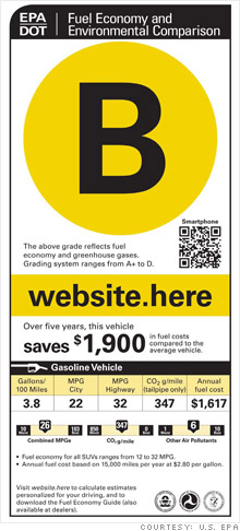
It seems appealing because it's simple. The most salient feature of this proposed label is the big letter grade in a colored circle. Better grades -- and brighter colors -- mean better fuel economy.
Don't be fooled, it's a really bad idea and here's why:
First, it's unnecessary. Fuel economy is already described in nice easy-to-compare numbers. We all know that 40 mpg is more efficient than 25 mpg. Turning that into letters and colors only adds a layer of pointless translation.
Second, it's confusing. Imagine a car shopper going into a dealership and seeing a car that's not very dependable and that has poor crash scores with a yellow A+ sticker on it. Nearby is another car of flawless quality with excellent crash ratings and a B+ in the window. Try telling that customer they're really better off buying the B+ car, not the A+ car.
With these stickers, that scenario would happen a lot. Fuel economy numbers already work without seeming like a government-approved sales pitch, so let's use them.
Beyond the oversimplified letter grade at the top the rest of this label is, ironically, a confusing visual babble. There's simply too much information here for anyone to make sense of.
This fuel economy label gets an F.
NEXT: Simple sticker
