Hey Facebook! Here's your privacy redesign
We asked several leading user experience designers how they'd overhaul the social network's obtuse privacy settings interface if given the chance. Here, in their own words, are their innovative solutions.

Privacy in context
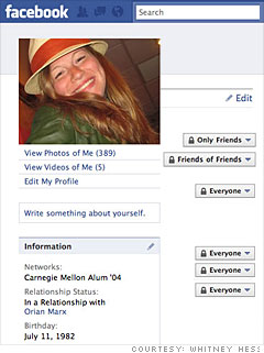
With Facebook, it's largely a communication issue. Privacy settings are completely divorced from your actual information. You have to either bring up both pages simultaneously, which is cumbersome, or you have to remember what you put into each of those fields and what those fields were labeled, which isn't typical behavior. So when redesigning, I didn't think the issue that needed tackling was a better design of the privacy settings page necessarily, but actually the context in which those privacy settings are being set.
The two key pages I thought people are most concerned about are the info tab and the wall. I used the same drop downs that exist on Facebook today, which I felt aren't really poor in functionality or usability. Those drop-downs are actually pretty clear. Already, there's a distinct difference between "Only My Friends," "Friends of Friends," and "Everyone," and I think that those are fair groupings. But they need to be displayed in context to give them a lot more credibility. By doing so, I think it makes people more comfortable about what they are saying and takes these settings from being purely conceptual, to something concrete. Users will see what they have an impact on.
NEXT: Catriona Cornett
