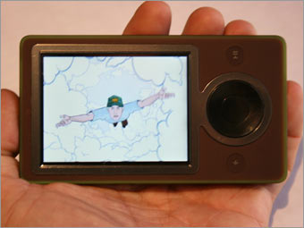
I'm a long-time fan of Apple's click wheel, but the Microsoft team has outdone it. Navigating the iPod sometimes means backing out of multilayer menu choices one step at a time. With the Zune's interface, it's much easier to drill down through music or photo choices, or to scroll horizontally through albums, artists, playlists, songs and genres. For those who have long lists of albums or artists, the Zune aids in rapid scrolling by showing a large letter of the alphabet, letting you know, for example, that you've reached the R section.
It also flips between vertical and horizontal view automatically, to take advantage of the Zune's wide screen (the Zune is meant to be held sideways [horizontally] when viewing videos or digital photos). When watching a video in widescreen, the controls of the round pad flip, too.
One particularly nice feature is the simple way Zune allows the user to customize the background screen with any photo or other artwork. The iPod lacks this customization feature.
If you don't count the work-in-progress Zune software and Marketplace, the Zune's interface is quite good; some may prefer it to the iPod's, which is saying quite a lot.

User Interface
|
|
