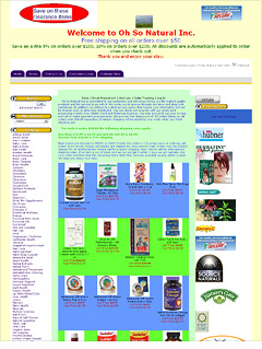
Fix this Web site
Our makeover mavens take apart an ailing e-commerce site and highlight traffic-boosting design and navigational changes.

Question: I started my company, Oh So Natural Inc, about 3 years ago, and sales have been increasing ever since. I built the Web site myself (with no knowledge of Web site building) using the template provided by my Web hosting company. I am looking at having the site professionally redone, but until that happens, I would like to see what insight you can provide.
- John Delmer, president
When viewers first get to your Web page, they're not sure where to start. The eye wanders because there is too much unnecessary content and wasted space.
Let's start at the top. "Clearance Items" is important but should be further down the page. Also, it needs to be spruced up so that it looks more professional; what's there now resembles a crude Microsoft Paint creation.
The photo in the center is a complete waste because it's too small and the graphic on the top right looks like an ad. Get rid of both.
So what should go on top? Because it's the first thing the user will see, this spot should say what the site is about.
"Go with a logo - something crisp and simple," says Walt McClure of Camden, Del.-based McClure Web Design. "It can be the company title, but make sure it's not just the text you have now. Try a Photoshopped graphic to beef up the brand and instill user trust."
Also, try using some photography in the header to show the experience of the products. "If you have a photo of a happy, healthy family, it will show the benefits of using all-natural products," says Ned Savoie of Portsmouth's Harbour Light Strategic Marketing. "People will think that they can enjoy life more because of the perceived association with the products. Studies show that people respond to human faces in the photos."
You don't need a custom photo shoot for this. Licensing a stock photo will cost far less.
NEXT: Clean graphics
| Sponsored by |

