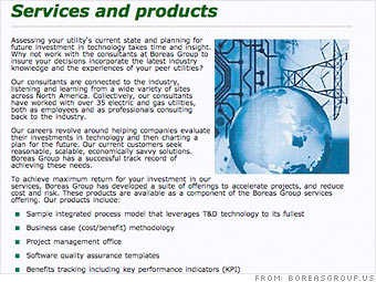
Like the tagline, the text on your homepage is too small, tightly packed and confusing.
"Put some distance in between those lines and give it some air," Schaf says. "You need to maximize the readability, which includes font and spacing."
Martin suggests increasing the font size and pulling the text further away from the image and the navigation column. "There's a lot of information to grasp, and the crammed feeling makes it even more difficult to soak it in," she says.
Schaf applauds your use of bullet points, which is a good way to outline services, but he doesn't think the actual text following those bullets is easily comprehendible.
"I had to read it several times to understand what Boreas Group is about," he says. "You need to get your core mission and vision out in simple terminology."
The best way to make sure your message gets across clearly is to tell an outside copywriter what you want on each page. A third party can often better translate the text than someone who is immersed in the industry and its jargon.
NEXT: Images
| Sponsored by |

