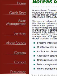
You want to arrange your site navigation in a meaningful way so that clients can get to the services they want to see quickly and easily.
"You never want more than seven or eight buttons on the home page because that's the limit of how much we can easily assimilate in our brains," Schaf says.
You currently have eight.
Schaf recommends making the Quick Start and Asset Management sections drop-down subcategories when you roll over the Services category. "Think about the organization like a tunnel," he says. "If those are sub-services of your main service, it would intuitive to find them through the services channel."
Make sure your pages are consistent, Martin advises. She noticed that headers on some pages have all their letters capitalized ("Quick Start," "Asset Management") while others don't ("Services and products").
Finally, both our experts noticed a dead link to "press releases" in your "About Boreas" section.
"That's a big no-no," Schaf says. "Your credibility will go down the tubes because clients will think, 'What else will they miss?'"
More galleries
| Sponsored by |

