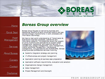
An attention-grabbing Web site
Our Web site makeover experts dissect an aging small-business site that needs a new look and modern navigation. Find out how to make your site credible and compelling.

-Robert Sarfi, Boreas Group LLC
Answer: Indeed, your site is outdated. We checked in with two design experts for their views on what you need to do to get the site up to speed. Their top tip: Decide what image you want your company to project, then brainstorm ways to bring your site in line with that branding. In the next few slides, we've broken out the issues that need the most attention.
"My first impression is 'What is this?' It's drab, blurry, faded and looks like someone was playing around with Photoshop for the first time," says Meredith Martin of the Killswitch Collective design firm in Chicago.
The header also doesn't do any justice to the logo, which gets lost in the graphic's texture.
"The logo would do better on white," Martin says.
Although the logo is clean and bold, it's awkwardly placed. Visitors are used to seeing logos on the top left of the page.
Also keep in mind that your logo and the tagline below it should clearly state what your company is about, since it's the first thing the visitor reads. Right now, your tagline is "Leveraging IT to Optimize T&D Operations." That's a muddle.
"At a glance, I thought IT was 'it,' and I have no idea what T&D means," says Stephen Schaf, creative director and owner of Hotbed Creative in Indianapolis.
His advice: "Simplify the tagline, put it in layman's terms and make the font larger."
NEXT: Text and font
| Sponsored by |

