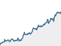
This animated data visualization translates the ups and downs of the 2013 stock market into musical notes. For every day, a piano, an organ, and a guitar come together to form reggae-like chords on the off beat of the song. There are only two chords -- a higher-pitched one for days that ended with market gains, and a lower-pitched one for days that ended in a loss. Weekends and holidays "carry the chord" from the last trading day, so if a Friday was up, the weekend gets the high pitch as well.
On top of this chord framework is a melody line that syncs with the bars as they rise to their position in the circular bar graph. The melody is played by a pure keyboard sound that starts out as a bass instrument, and ends up as a bright digital tone. The pitch for each note is determined by the daily closing numbers of the S&P 500. Each note covers 10 points on the index, so if there was very little movement from one day to the next, the same note is played twice. And the drums? Well, they're just there to help make it a song. Follow the ever-rising melody to relive a record year -- and check back in early January to see the completed visualization and download the final tune!
Which S&P 500 stock was the to top $1,000? Test your investment chops by answering that and other questions about how Wall Street fared in 2013.

2013 was the year of all-time highs for the Dow, S&P 500 and many high-profile blue chips like Google and Disney.