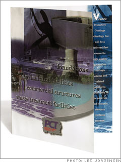
Layout None of the imagery stands out, making it hard to identify the company or its products. "There's a nuclear reactor there, a guy holding a calf," says Brier. "What does any of that have to do with Poly-Wall?"
Color The murky color "doesn't grab anyone's attention," says Brier. Plus, competitors use similar shades of blue and green, making it harder to differentiate between brands.
Logo The company used two or three logos for about ten products. "Our name recognition was very poor," says Libke. Also, the red strip and dark-gray background obscure the text - the logo is inconspicuous.

