The car's "center stack" - the set of audio and air-conditioning controls that runs down the center of the dashboard area - is flat and completely vertical. It's unattractive while also making the bottom row of climate controls awkward to reach and use.
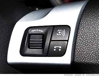
Again, these controls are marked for maximum confusion. Buttons have strange acronyms like "BC," "AS" and "LOC." Markings around the climate control knobs are small and hard to see. Even when the words are clear, settings are difficult to find and use.
The Astra's interior is a real shame because, in its American products, GM has made huge leaps in interior design and has long been a leader in straightforward functionality. Compared with GM's other recent products, the Astra's dash layout seems, as the car's name implies, like something from another planet.

