The colorful world of the Pantone team
What's next year's 'it' color? Ask the Pantone Color Institute. Its members travel the world to find out what hues will move product.
 |
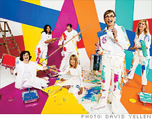
| Leatrice Eiseman (standing, second from right), executive director of the Pantone Color Institute, with her color team. |
(Fortune Magazine) -- Long before orange made its debut as a hot hue, Leatrice Eiseman spotted it in several unlikely places: on fences and front doors in Italy and Germany, in Morocco's natural dyes, and on monks cloaked in saffron robes. At the time the color wasn't associated with spirituality or trendiness in America, thought Eiseman, but rather with discount stores like Big Lots.
As she began to notice it in multiple places and in different contexts around the world, Eiseman and her team at the Pantone Color Institute -- the forecasting and consulting division of Pantone Inc., which is part of the $261 million company X-Rite (XRIT) -- decided to put it at the top of their 2003 forecast.
Since then, orange has gone mainstream, blanketing such unlikely products as videocameras, KitchenAid blenders, and Ford's new F-150 SVT Raptor, now available in "molten orange."
"Product manufacturers finally understand that color really grabs consumers' attention," says Eiseman, the institute's executive director. "It's a way to entice people."
The Color Institute's parent company, Pantone, invented a numeric system to codify a spectrum of hues for graphic designers and publishers in the 1960s. In the 1980s companies like Elizabeth Arden (RDEN) started to look to Pantone's color array for shades of lipsticks, and Pantone realized that it needed to create a system for other industries. That's when names for colors -- cognac, parsnip, cameo pink, and more -- were added to the numbers. Today there are more than 1,900 Pantone hues.
To find the next color du jour, Eiseman and her team traverse the globe. They frequent trade shows, follow the production of upcoming movies, and read everything from tech magazines to psychological studies.
While the team is scattered across the country (Eiseman is based in Seattle, creative director John DeFrancesco in New York City, and the rest of the team in New Jersey), they're in constant contact either by phone, e-mail, or in-person meetings to discuss their findings.
"Forecasting is a marriage of trend directions," Eiseman says. "It's about how many places I'm seeing a color -- if it's popping up in graphics and products. Not just on the runway."
Once thought of as a mere service for its parent company, the Color Institute now publishes five reports a year that sell for up to $750 per issue. The highly anticipated reports have become a must-read for product designers across numerous industries.
Instead of sticking with a traditional blue -- America's favorite color -- manufacturers of skillets and skis alike look to the institute to guide them on how to give their products a "new" blue, in periwinkle, perhaps, instead of navy.
Fashion designers, of course, play a key role in determining color trends, and the institute relies on their input. The semiannual Pantone fashion color report surveys 50 top designers about what colors they'll be using for the upcoming season. The Pantone team takes the information and calculates the top 10 choices. Hot for spring and summer 2010: tomato pur�e, aurora (yellow with a tint of green), and turquoise.
Consumer psychology plays an important part in color forecasting too. Take brown, as an example. For years the color connoted images of wood and dirt. That changed in the late 1990s, with food trends like the rise of Starbucks (SBUX, Fortune 500) and the success of the romantic flick Chocolat, says Eiseman. A color that was once seen as dull or unattractive transformed into a shade that became synonymous with high-quality food and good taste.
The state of the economy might have the largest impact on the colors consumers favor. When the market tanks, people often retreat to neutrals, says Eiseman. But lately, instead of ignoring color -- think back to the grunge trend during the downturn of the early 1990s -- people tend to be cautious with big-ticket items but add color through less expensive purchases.
"Color is a way to build up your confidence," Eiseman says. "It makes you feel better." That may be why the institute chose mimosa yellow as its 2009 color of the year; according to Eiseman, it's a hue that carries psychological overtones of change and enlightenment for consumers.
As for next year's color, Eiseman isn't telling. But she did share a few hints as to what will factor into her team's decision. "People are wanting someplace to go, somewhere to retreat to," Eiseman says. "My challenge is to come up with a color that speaks to how we can create a feeling of escape -- to get away from the problems of the everyday world. Even if it's a fantasy." ![]()
-
 The retail giant tops the Fortune 500 for the second year in a row. Who else made the list? More
 -
 This group of companies is all about social networking to connect with their customers. More
 -
 The fight over the cholesterol medication is keeping a generic version from hitting the market. More
 -
 Bin Laden may be dead, but the terrorist group he led doesn't need his money. More
 -
 U.S. real estate might be a mess, but in other parts of the world, home prices are jumping. More
 -
 Libya's output is a fraction of global production, but it's crucial to the nation's economy. More
 -
 Once rates start to rise, things could get ugly fast for our neighbors to the north. More


