What's in a new logo?
It can invigorate a company's image or squander its brand equity. To see which gambles paid off, Fortune turned to a few experts to judge some of the most dramatic transformations.

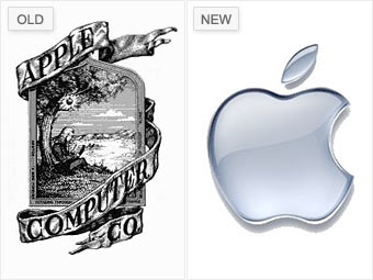
Ronald Wayne designed Apple's original logo in 1976 when the company was still operating out of a garage. It shows Isaac Newton sitting beneath a tree with an apple dangling precariously above his head.
Rob Janoff used the same apple in his redesign a year later. "You can almost feel the '70s and '80s taking place when you take a look at that rainbow apple," says Bill Gardner, principal of Gardner Design.
Apple dropped the multi-colored logo in 1998 for a monochromatic version, produced in every color imaginable, until transitioning it to today's popular shade of chrome.
NEXT: Blackwater to Xe -Sneaky and confusing
