Nathaniel Perez, Eddie Gomez, Omar Mendez
Right now, all the settings are very linear. Because they're literally one after the other, you might get tired after changing just 4 or 5 of them. And because you're changing these settings individually, you don't have a clear idea of just how much you're exposing yourself.
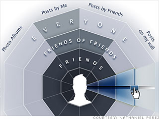
In redesigning them, our intent was to take all these settings that were once presented linearly and bring them to life in one circular graph. At the center is the user, with sliders for each category area, going towards the outermost public layer of privacy. Sliding it through layer, or group of people, would color that cone red, and as you change these settings all around these different values, you achieve a very simple, but concise, pictorial description of the overall amount of red that is in the circle. This lets you know how open you are on an aggregate basis, which is kind of hard to tell if you're just updating things with a drop-down in a linear list.
NEXT: Michael Jones