Makeover: Get users (and Google) to trust your Web site
The problems: Too much jargon, murky navigation, and poor search-engine visibility
The fix: "We took into account a lot of the feedback given to us from experts and the [reader] comments," says Justin Groden, a business development specialist at Fused Solutions, which providers customer call centers services. "We looked into the overall layout of our services and did a big upgrade in terms of design. It's not perfect, but it's a newer look."
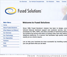
Since the redesign, Groden says he's seen an uptick in traffic. A new sidebar directs visitors to the company's most important sub-pages, and the distracting graphics at the bottom of the site's homepage were removed. Fused Solutions modified the site's text by simplifying the jargon and adding additional terms that potential customers might use in search engines.
"They changed the content on home page to be live text and modified it with keywords, which is huge," says Greg Ricciardi, partner at 20nine Design Studios. "From an SEO (search engine optimization) standpoint, they've made huge strides."
Another big plus for future clients: the site finally has a "contact us" page.
Ricciardi says Fused should consider making its home page more dynamic so that there is always something new and fresh. "There is nothing that drives new content, so once Google indexes this new site, it won't refresh," he says. "The pages will be lost over time unless you drive news with RSS feeds or change the content often."
Ricciardi also thinks that the new graphic of a customer service rep is not any more visually appealing than the old, similar graphic. "Get something that is more splashy," he recommends.
Groden knows his work isn't done. "We implemented an open-source content management system. I can login and make a new page without a Web design firm," says Groden. "So we're constantly refining it because, the way the Web works, it'll be outdated in a day or two."
NEXT: The Miller House
| Sponsored by |


