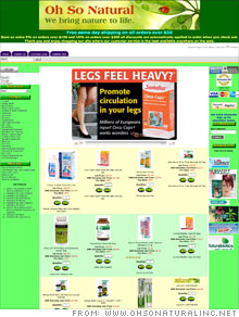
Makeover: Fix this Web site
The problems: A crowded design, garish colors, and a navigation bar with too many options
The fix: "I made changes where I could without hiring a Web site designer," says Oh So Natural's founder, John Demler. "I have no training in Web design, so it's trial and error. But our sales, considering the economy, are moving along pretty good, and we even had some record-breaking sales this summer."
Demler says he tried to make his bath and body products e-tailer site more user-friendly by implementing a shopping cart upgrade. He removed the duplicate pages that confused visitors. Also, Demler started a Google AdWords campaign, which he hired an outside company to run.
Demler also cut back on the neon colors and added a header that is more visually appealing. The top-selling products now rotate prominently on the home page.
"The header could be tied into the site better to avoid a boxy look, but overall it's a great improvement," says Ned Savoie, creative director of Harbour Light Strategic Marketing. "I also like the featured products, although, again, the implementation could be done so it feels more integrated with the site."
Savoie says that the color scheme still needs improvement: the green is very artificial, and the product backgrounds don't work well with it. He suggests a white background so the product photos don't feel boxy. He'd also like to see the display reigned in.
"It makes it difficult for a user to read when content spreads across the whole monitor," Savoie says. "I would prefer to see the site have a fixed width so it controls the content, rather than spreading it out on higher resolution monitors."
Finally, Savoie suggests using smaller fonts for content that is less important (FDA disclosures and shipping information, for example) and adding a strong introductory section. Currently, the only real marketing copy is all the way at the bottom of the site.
NEXT: Scenic Rentals
| Sponsored by |


