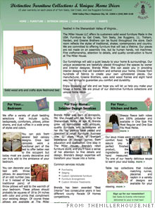
Makeover: Get focused on getting customers
The problems: A dark homepage, muddled navigation, an aging design
The fix: Furniture store owner and interior designer Brenda Miller worked hard to overhaul her Web site after our experts picked it apart.
"You would never know how many people wanted to help me after the article ran. People were throwing prices out at me and one designer, Steve Gergens of CDS Web Services, stuck out," she says. "He sent me color samples and gave me a mock of the new home page. I fell in love with it."
Miller made sure the new design implemented every piece of advice the article suggested. In addition to the new color scheme, the Web site's redesign included a new navigation, layout, and catalogue. The improvements have boosted traffic 33%.
"I've got a higher ranking on Google -- I was on the second page for 'Gat Creek' but now I'm on the first," Miller says. "The only thing I haven't done is to add a cart, because I don't want to pay the monthly fee for it. But that is high up on my list of things I want in the future."
Miller has also stepped up her online marketing. Previously, she hadn't put her customers' e-mail addresses in a database. Now she has them all saved and can blast out an alert of an event.
"Aesthetically, it's on right track," says Rich Schefren of Strategic Profits, a marketing consultancy firm in Delray Beach, Fla. "Really now the only people that should be giving her advice are her customers."
Schefren suggests boosting traffic to the site through a pay-per-click campaign. Miller can bid on keywords like "Tom Sealy" or "Gat Creek." Once she sees the conversion rate for each, she can use the most lucrative terms to build her site's traffic organically by placing those terms more prominently on her site.
NEXT: Oh So Natural
| Sponsored by |


