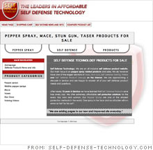
Makeover: Rule #1: Don't terrify your customers
The problems: Poorly written marketing copy, an overloaded design, and a confusing purchasing process
The fix: This retailer of pepper spray, mace and other self-defense products toned down the home page by removing most of the jarring red-and-black color scheme and consolidating the text into a concise introduction and list of top product categories.
The product pages now have enlarged images with accompanying descriptive text. Plus, each product has its own page, so the visitor doesn't have to scroll forever to see all the content. That's also a boon for search engine optimization.
One big downside: The old pages are still alive. From the products links on the right of the home page, the visitors are directed to the new, improved pages. But from the top tabs, they still may wind up encountering the site that our experts had critiqued.
Noam Kerner of Noam Design says there is still a long way to go before the site is easy to use and clearly trustworthy. "There are countless platforms and Web site solutions out there -- many of them are very professional," he says. "Get back to the drawing board, abandon whichever Web team you've been working with, and get real about your online business. Seriously."
Serious entrepreneurs won't get far with amateur Web sites. "Everybody has a cousin or a friend who's a Web designer. But in today's economy and in today's Internet market, buyers are not shopping on crappy sites," Kerner says. "No matter what your industry or target audience is, customers are savvier, smarter, and more particular about their online shopping experience than they were just a year ago."
More galleries
| Sponsored by |


